Tuesday, July 3, 2012

Old Tricks For New Dogs

Two in a series I am working on. Just one thumbnail, one sketch, one final.... Just for fun. I had a character development project drag out for way too many sketches and way to many color variations and as a way of exorcizing the demon I wanted to do a little series just for me. Only one thumbnail. then blow it up and paint the finish....I think the demon is gone, but I like the series and think I will do a few more.... All Material © Bill Mayer 2012 EDIT: Here's three more.. couldnt just leave it at two..thinking a grim backstory to tie these guys all together.. stay tuned

Monday, June 11, 2012

Dellas Graphics Calendar 2012-2013

Always such a treat when this Dellas Graphics calendar rolls around. A chance to draw frogs( which I love) and a chance to bounce some fun Ideas off Jim Burke. Always such fun .This year was no different. Started the same as always with the normal batch of thumbnails, some subjects I am sure I have hit on before...some new ones. I always hope to find my way to something compelling and downright fun to illustrate. There are always so many ideas that it is hard to make up my mind, so I tightened up a few of Jim's favorites and threw in a few of mine. Always hoping to flush out just the right one. This year I I fell in love with this little Devil character and hoped to add an Hieronymus Bosch scene of a battle between the hoards of bugs and helpless frogs being slaughtered and tortured. However all of this seemed just a bit too dark so I added some little dancing figures to add to the pagan romp. Rendering all of this seemed daunting so I almost shelved the whole thing. Then I thought if I kept the figures simplified like silhouetted little embers, that might just work...so I did some thumbnail scenes of battling bugs and dancing devil frogs. I scanned them in and built a little Bosch environment to embellish the large figure.I added a simple fortress in the same silhouetted way, keeping the whole illustration dark in tone...not exactly what I had originally thought about doing, but I am lazy so it was as good as it was going to get. details of painting... There is always plenty of time on these guys ,so it sat around for a month or so while I worked on other stuff. I figured at this point I had not heard from Jim in a while, so maybe time to check in and see when he needed the art .I still had a couple of the thumbnails I had really liked in the beginning, before we we went off in this direction of the devil. Monday morning I dug out the old thumbnails and inked in the main characters, then started on the crowd. Actually, the crowd took longer than the main characters. By the end of the day I had them all scanned in and put together. Ready to start on color. Tuesday , I played around with color. I really liked the black and white, so at first color was very limited and cautiously added.The very first thing I tried was a red carpet. I love black, red and white. The limited color can look so sophistcated. It just kind of grew in this direction , I guess that's the way it always happens. I still like the heavy strong black and white drawing without color alot and it took a while to stumble on something I liked more. I finished it, or at least thought I had finished it enough to fire it off to Jim to see if he liked it... I think Jim had already made up his mind before even seeing it... i think I liked the "Devil" too, so this one was just not going to make the cut. I had one last thought, and a few more frog drawings rolling around in my head . I added a little "fly boutonniere" on the HIp-Hop-ster's lapel. Silly I know, Lee laughed but said know one will ever see that... Anyway, always such a treat to do one of these frog drawings. Jim is such a delight to bounce ideas off of and the results always leave me with a really great feeling about work. Thanks a ton Jim, can't wait to see what all of the other folks do... Naturally, © Bill Mayer 2012

Friday, May 18, 2012

Fear Of The Dark

I walked into a dark room and waited for the light to form outlines around the objects in the room. I was thinking that if I sat there long enough that my eyes would adjust and I could make out faint lines around the objects in the room. I waited and waited there but no colors appeared instead just black, only black… I thought about a story an art director from Japan was telling me some time ago. We were working on a calendar together. When he was a child growing up, Japan was still very closed to outside media in fact it was the early sixties before they had their first live broadcast from the United States. Hard to believe it now with live images streaming in for all over the globe. He said it was a really big deal for them when it happened. He was in early grade school and they had been talking about in class for a month. There were announcements all over Japan about this huge event. Everyone was so excited, especially him because he had been chosen in his school to turn on the TV for the broadcast, He was so thrilled to be chosen from his class to given this honor. They all gathered in the auditorium and waited for the time to turn on the broadcast. As they all sat waiting for the very first images to show up the TV flickered and rolled. A Sweaty smoking American appeared on the screen and announced… What came instead was the unthinkable…. Pandora’s box was now open and the world would never be the same. I wondered about this if it could be true so I did a little fact checking. In 1958 only ten percent of the households in America had Television. On November 22nd 1963 there was planned a prerecorded statement from the President of the United States to the Japanese people. On the very afternoon of his assassination, networks planned the first trans-Pacific telecast -- a pre-recorded segment of President Kennedy offering his greetings to the Japanese people…Instead of the greeting they received news of the tragic events unfolding. Hard to believe now days when we get live broadcast from planets in our solar system, When Daly tweets of news around the world are just as routine as a cup of coffee. I can see the parallel between his story and Pandora’s box. I see the fear of trying something new, trying something unexpected .You might fail miserably, but maybe you just might stumble on something new…. and if you always do the same old thing and never open the box all of those scary wonderful things might never find there way out…. I went back into the dark room and closed the door. It was still so black, but this time my eyes saw color. When Prometheus stole fire from heaven, Zeus took vengeance by presenting Pandora to Epimetheus, Prometheus' brother. With her, Pandora was given a beautiful container, which she was not to open under any circumstance. Impelled by her curiosity given to her by the gods, Pandora opened it, and all evil contained therein escaped and spread over the earth. She hastened to close the container, but the whole contents had escaped, except for one thing that lay at the bottom, which was the angel of Hope named Astrea.­­

Thursday, May 17, 2012

Sage Advice

Another spot illustration for the fabulous SooJinn Buzelli. This one was an article for Upfront section of Plan Advisor, called " Sage Advice". My thinking conceptually started with trying to draw from and old Aesop fable , Like the tale of "The Ant and The Grasshopper" or " Icarus" who ignored the advice of his father and suffered the fall into the sea. But all of these seemed maybe a bit off tract so I tried something a bit more abstract. The problem was on one level to find an icon to represent the knowledge or the person containing the knowledge of which you were seeking. So maybe books, maybe a old Greek statue of a philosopher, made of stone with real eyes staring back out at you. The hand with the eye was along this same rambling direction. SooJin Wrote back that she liked this direction #13. the hand with the eye in the palm. A simple variation that seemed to appeal to me as well, being a child of the sixties. I pulled together a tighter sketch and sent it off for approval. I got a note back from SooJinn "I think I prefer just one hand like the small sketch you sent first.Thanks. SJ" So embarrassed ....in my haste to shoot off a sketch quickly I used to same piece of parchment to blow up a refine the medium and larger refined sketch but didn't take the time to retouch it out before sending. Now I had to explain this embarrassing little slip up. oops... No worries transferred the art to the board and and started painting. In my head I always had sort of a spiritual Hasma in my head.It's a universal sign of protection.The Hand , particularly the open right hand, is a sign of protection that also represents blessings, power, and strength, and is seen as potent in deflecting the evil eye. The illustration went fairly fast but I had a little time to sit on it and later played around with adding the symbolic elements of currency to the hand,in the form of tattoos that are engravings from the American dollar. and in the elements fro foreign money i used like stamps in the background. All together I think it gave it a nice surreal feeling. Plansponsor; Sage Advice © Bill Mayer 2012

Wednesday, May 9, 2012

Communication Arts Illustration Annual 2012

So happy to have my little stamp drawings included in the new CA Illustration Annual . So many fabulous and talented artists there. Thank you to the judges and editors at CA , it is a great honor to be included. These little drawings' ultimate use was for a recruitment brochure for an old Boston financial advisor, Cabot and Moore. It was such a pleasure to work with long time friend and great designer, Rick Anwyl at Son & Sons on this project, and this recognition has made it even a little sweeter . This certainly seemed a perfect match of intelligent application and clever design. As Always, All Material © Bill Mayer 2012

Sunday, April 29, 2012

New York Times

Here's a new little illustration for the New York Times this weekend. A feature article about the data sharing trail.The writer Follows the trail of just how much trading information is going on."If you have ever felt inundated by such solicitations, by e-mail or by snail mail, you may have wondered what you did to deserve it. I did.I wondered how all those campaigns, companies and institutions got my number. And how much money data brokers behind the scenes might make by flipping my name and address." Minh Uong had called me but the last two times he called we were out of town. The one Last week on Google...I was kicking myself about, so I was thrilled to get another call from him this week. Thumbnails start our the same way as usual (1-7)I was really thinking more about the digital side of someone being spied on or the invasive side of having everything you're reading scrutinized . Mihn got me on the track of the Magazine, saying he thought it was an important par of the visual story (8-`12). After sending the thumbnails over to Minh, we met some friends for lunch . On the way home I had one more little idea and did a quick thumbnail and shot it off to him to get some feedback. Minh said he'd get back to me as soon as he could. I knew it would be a bit so .went to the mountain for a nice walk. When I got back he had left a voice mail and an email saying did you get my voice mail.Tthey picked #12 , but could I make it a bit more vertical, really he left the size was up to me, just give him a tighter sketch to work his layout around....I did a couple of new thumbnails trying to get the perorations of the figure a bit better. ended up with this stylized version. and one with a Figure reading standing with a weeny dog on a leash. He thought the latter was a bit too "New Yorker" so we went with the "A" version torso only. I got in pretty early and started working on the airbrush drawing.Thngs went faily fast and by noon I had that done and scanned and was starting to put some colors together. it was pretty simple so I was trying to make the whole thing colorful... Minh had said to make sure it looked like a magazine, and with the color pallet moving tward the warm colors I was not sure the shape of the magazine would pull that aff on it;s own. At leats not as quickly as if I added something on the cver. "Look" seemed to be the perfect out of print candidate. Minh says " some thing that's not a playmate..." .Heading to the attic to sort through old magazines can be a quagmire. Finding the cover was pretty easy. Finding the back that was not a cigarette ad proved to be a bit more challenging. But scanned them in did a little editing...and bluring tweaking the colors...and noise so they didn't draw too much attetion...Now that seemed to fit in., I had most of the colors worked out and ran into one hiccup. The eyes, the eyes I had drawn in my sketch were looking all in different directions. I tried this several times in different colors. everything I could think of but it just looked odd. I scrapped that and kept the eyes straight ahead looking at the reader. I liked the color they added and I knew it was different than the sketch but to me it still seemed to work conceptually. I thought let's just take a break and get away from it, maybe when I look at it fresh it will come to me how to solve this little problem. Looking back I think any of these options straight forward would have worked. The the plan was just to take a short break and go climbing with some friends but one thing lead to another and it was closing in on midnight and obvious I was not going to make it in tonight. The art was due at noon and I was supposed to be in court in Lawrenceville,a forty minute drive at 10:00. I hit the studio early 6:am, tweaked the drawing played around with the eyes but still couldn't get it to work, I liked the eyes straight forward. I sent the art to Minh and hoped he would agree.... I went ahead and uploaded the High rez file and sent a link to him...8:50... I left a voice mail and hit the road...I called Minh after court and He agreed the eye thing worked better staight forward... Much thanks Minh After thoughts Never stop wondering what things would tweak the little drawing to be a little better? So i thought I would do a little dialing in the hues and see what it would generate. Maybe bluer? Maybe a little Greener? Maybe somewhere in between,,,, Strange , it gives it a totally different feeling...I never use cool pallet. but it gives it a dreamy quallity...

Friday, April 20, 2012

Fear Of Food

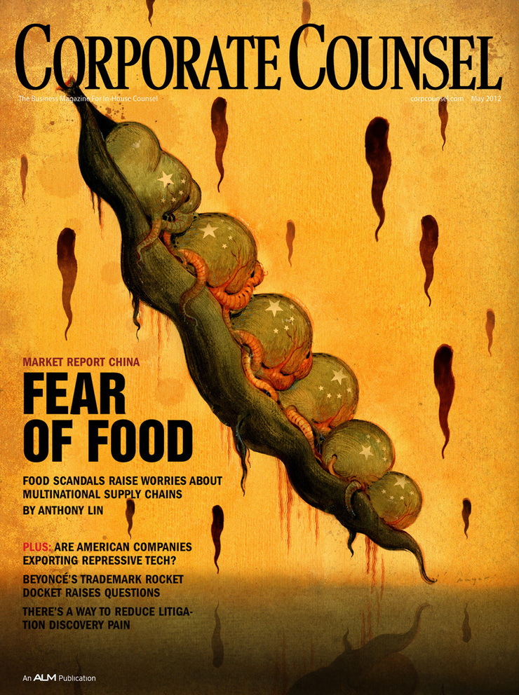
This is a horrifying little story about the problems with the quality of food supply in China for both the Chinese market and for the countries to which it exports food products, like the U.S. Food scandals have made consumers here and in China nervous, and they’ve also gotten the attention of multinational companies that operate there. Many of these companies have opted to manage their own foosupplies by policing and auditing them. Some pretty shocking examples that would make you literally sick. Crazy stuff. Morris Stubbs , my Art Director,wants a cover illustration with a 'dark tone' that goes with the story. ”Something a little shocking”. It’s like 'The Rotten Earth' that I did last year, a little gouache sketch of a blue face with soulless eyes bleeding a slimy black pitch… "The U.S. Government had sufficient concerns that it opened an FDA office in China the first one ever established overseas. Progress has been made. But there are still huge concerns. One of the main sources for this story a lawyer who lives and works in Shanghai says that just about all the food he eats there is imported." I talked it over with Morris and got started on thumbnails. I've always loved dark and slightly evil directions, like he usually wants. I did a dozen great little ideas and shot them off. They have a direction now, anyway. - "Bill when you get this email give me a call, we like #8 "peas" but I'd like to work the China flag into the pod but softly and remove the faces and just have very disturbed looking peas…” I did a sketch of the peas with out the faces. It was so bland. It just seemed like there was no concept anymore so I called Morris and tried to sell him on putting the sculls back in… He said they still felt that it made it too personal, like it was the Chinese people doing this and not the powers in charge. He advised to just make the peas look nasty and deformed. After he let me know he could give me a few more day, I started thinking about how I was going to salvage this. At least I had a bit more time to procrastinate. Instead of a the Friday deadline I had til' Wednesday… I half-heartedly made a stab at painting the illustration early Friday, But it sucked (seriously), so I opted for a nice walk and some climbing with my friend Goñi… It’s spring here in Atlanta and it’s truly one of the most beautiful places on earth… Meanwhile, I was still trying to think of a visual way to salvage this illustration. One night over the weekend I was drawing in my sketchbook and I came up with a kindof alien version of the pea pod. I figured this might be what it needs. It was more or less the “Invasion Of The Pod People” in my head…I was eager to get into the studio and paint this. I woke up early and headed in around 6:00 am I have the painting done by noon and started scanning it in. Another few hours of editing and tweaking digitally and it’s working pretty well. Goñi dropped by the studio to see what I was up to and I showed him the thumbnails. He liked the oriental face down in the lower right corner. He said I should do that one too! According to him, it would only 'take fifteen minutes'. I still had til' Wednesday so I figured what the Hell. I got right in on Tuesday and started on two more versions, including one I wanted to do a brush drawing on a red background. I figured this could be a really strong cover and worth the extra effort to see what it will look like. It ended up taking all morning. Then after lunch I jumped on starting the face. It took about two hours… I just put a spot in the middle of the eyes with the stars from Chinese flag. Wednesday morning I sent everything off for Morris to approve. He never respon­­­­ded on the other two concepts, just the original. He like it but the editors felt its was too scary and that I should get rid of some of the tentacles. While doing that I ended up getting rid of some of the strange alien sex parts my wife Lee pointed out, in the process . It ended up working pretty well so I send it off! After one final round of slight adjustments, trying to make sure it read with the type well. I Really happy with the way the final one was working,it's still my favorite, but started wondering how the art director felt about the final result. I wasn't sure if he did or didn’t like it because I tried so many other directions did that give him the impression that I was not satisfied with it? But really that was not the reason. I always wonder how one of the other ideas will turn out. Later on I replaced the spot on the oriental face with a nasty fly. I liked the fly so much I ended up going ahead and scattering them all over the face. It certainly worked better conceptually. Another fun little illustration. I comped them up to see what the other two would look like as covers too. Well, I definitely still like the original, but I don’t know now …”The Flies” just kind of work….­­