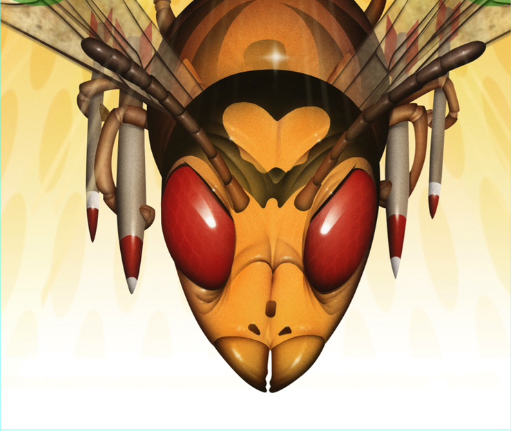
Here's little illustration for Fast Company. "For breeding a natural alternative to harmful agricultural pesticides." So thrilled to be back on their radar. Used to do a lot for Fast Company... this one was a blast. When Ted Keller called me about this article it just seemed like such a perfect match. These wasps were the good guys; Bio-warfare against destructive larva, but instead of using pesticides they spray the fields of crops with wasps. Like an invading army, they devoured the larva... What a brilliant idea. "Killer wasps! Fear not--this isn’t the movies. These predatory insects are the good guys, programmed to target only their natural enemy (which is not your scrawny behind). Bug Agentes Biológicos mass-produces wasps to combat larvae and stinkbugs that threaten sugarcane and soybean plants, two of Brazil’s largest cash crops. This past year, Bug perfected a way to spray its wasps onto soy fields, just as pesticides are spread via airplane. "We can liberate the insects in the right dose, at the right speed, and with the right protection so they can be effective," says Francisco Jardim, a Brazilian VC who has invested in Bug and sits on its board. Wasps, for example, need to be protected until their wings grow big enough for flight, or else ants present a threat. (Isn’t nature grand?)"

Started on thumbnails, seems to take a dozen or so to get the ideas across. I liked the huge friendly wasp face, huge and right in your face, but Ted liked the wasp airforce, maybe some brazillian color or insignias. He likes this one also because it gives the impression of a lot of wasps without doing something really crowded. We're off and running.

I do a sketch of the wasps, add some weapons hanging on the underside....I would do the main three wasps and photoshop the rest, distorting them and fading them off in distance to give the impression there are a lot more .The airbrush drawing goes pretty fast. I do the wings in photoshop so I can adjust the transparency and shift them in perpective as the wasps recede into the background.

I wanted to use some sort of genome or DNA markers to add that little nod to the biological side, but just started getting way too complicated, so I scrapped this for the oval patterns interlaced with layers of light motion lines. I loved the color being somewhat all in one warm pallet, but as an afterthought, tried it with a dark-to-red background... This is interesting, but all of us like the bleed to white...


Ted's design is brilliant, Love this type....the online version is just as clean and fresh. This one was a total blast, can't wait to work with these guys again...just too much fun.

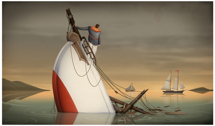 Asset International: Interest Rates Rising. Sink or Swim. Another illustration for SooJin, this one about surviving the impending European economic fall-out. I thought I would post this one as a simple tutorial on building an illustration in Photoshop. The thumbnails are all pretty straightforward. With a few of them I was trying to figure out a way to bring something in that would identify with Europe, but SooJin didn't think that it was important. She picks no.18, but says it's only showing the sinking scenario, and to have in the distance a boat that's survived the "interest storm." Adjust for the wider layout and shoot a sketch off and wait for approval.
 She gets back to me quickly and i transfer this sketch down to a board and airbrush the ship and man on the bow...The next step is to sort of get a handle on the pallet. the last one I did for SooJin was in a neutral color pallet, and looking at the subject matter, thought this one worked leaning that way as well.

 Let's start with grey...Block in flat colors to set the tone and mood of the piece.

 add some gradients
 Add the islands and simple reflections. Keeping it fairly simple...
 Adding some clouds and starting on some reflections in the water.I darkened the edges to make it a bit moodier.
 More detail. ropes and more layers of clouds...and a reflection of the boat..these are real simple just copy the layer and flop them over in transform adjust the transparency and mask them so it's not too even.
 Then a few final tweaks... Not trying to make this too simple...
 Done then shoot off a low rez for approval and upload the high rez and you're done....And there you have it, and there it this....Not trying to over simplify the illustration but building a neutral color pallet off a grey back ground is just one way of working with the color. Certainly there are a host of others. The neutrals seemed to work well with this one because of the "after the storm" concept...But you get the Idea...