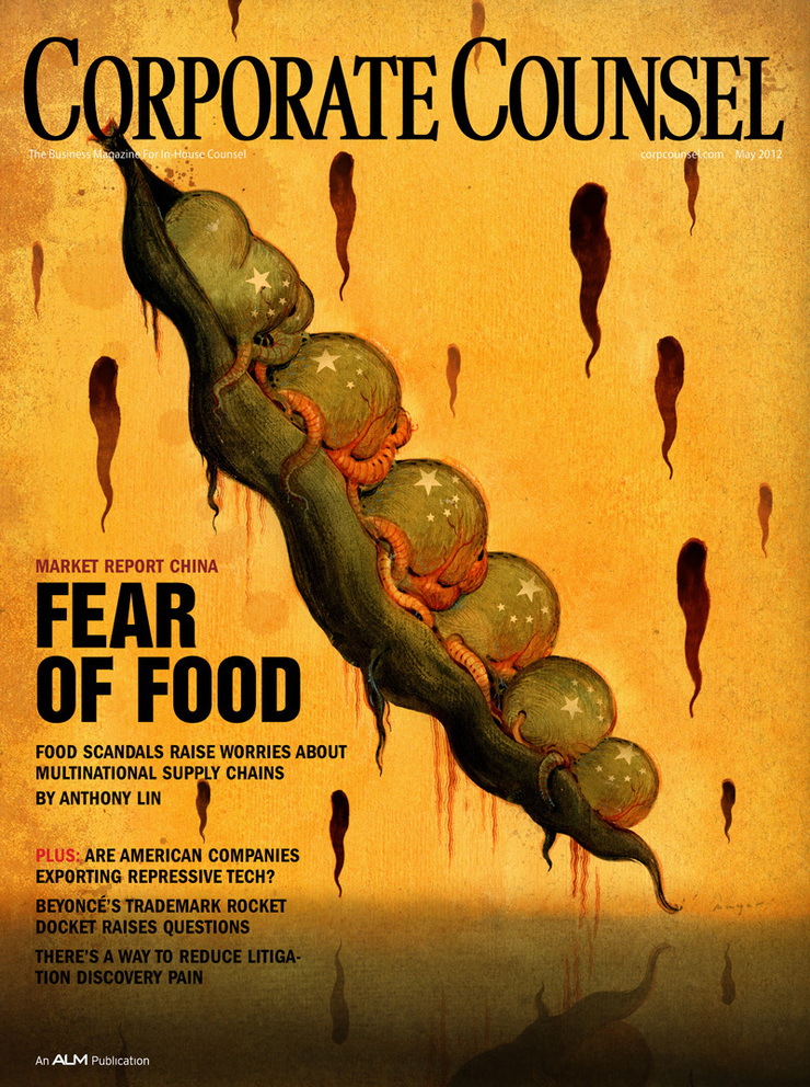
This is a horrifying little story about the problems with the quality of food supply in China for both the Chinese market and for the countries to which it exports food products, like the U.S. Food scandals have made consumers here and in China nervous, and they’ve also gotten the attention of multinational companies that operate there. Many of these companies have opted to manage their own foosupplies by policing and auditing them. Some pretty shocking examples that would make you literally sick. Crazy stuff. Morris Stubbs , my Art Director,wants a cover illustration with a 'dark tone' that goes with the story. ”Something a little shocking”. It’s like 'The Rotten Earth' that I did last year, a little gouache sketch of a blue face with soulless eyes bleeding a slimy black pitch…
"The U.S. Government had sufficient concerns that it opened an FDA office in China the first one ever established overseas. Progress has been made. But there are still huge concerns. One of the main sources for this story a lawyer who lives and works in Shanghai says that just about all the food he eats there is imported."


I talked it over with Morris and got started on thumbnails. I've always loved dark and slightly evil directions, like he usually wants. I did a dozen great little ideas and shot them off. They have a direction now, anyway.
- "Bill when you get this email give me a call, we like #8 "peas" but I'd like to work the China flag into the pod but softly and remove the faces and just have very disturbed looking peas…”
I did a sketch of the peas with out the faces. It was so bland. It just seemed like there was no concept anymore so I called Morris and tried to sell him on putting the sculls back in… He said they still felt that it made it too personal, like it was the Chinese people doing this and not the powers in charge. He advised to just make the peas look nasty and deformed.
After he let me know he could give me a few more day, I started thinking about how I was going to salvage this. At least I had a bit more time to procrastinate. Instead of a the Friday deadline I had til' Wednesday…
I half-heartedly made a stab at painting the illustration early Friday, But it sucked (seriously), so I opted for a nice walk and some climbing with my friend Goñi…
It’s spring here in Atlanta and it’s truly one of the most beautiful places on earth… Meanwhile, I was still trying to think of a visual way to salvage this illustration.

One night over the weekend I was drawing in my sketchbook and I came up with a kindof alien version of the pea pod. I figured this might be what it needs. It was more or less the “Invasion Of The Pod People” in my head…I was eager to get into the studio and paint this. I woke up early and headed in around 6:00 am I have the painting done by noon and started scanning it in. Another few hours of editing and tweaking digitally and it’s working pretty well.


Goñi dropped by the studio to see what I was up to and I showed him the thumbnails. He liked the oriental face down in the lower right corner. He said I should do that one too! According to him, it would only 'take fifteen minutes'. I still had til' Wednesday so I figured what the Hell. I got right in on Tuesday and started on two more versions, including one I wanted to do a brush drawing on a red background.


I figured this could be a really strong cover and worth the extra effort to see what it will look like. It ended up taking all morning. Then after lunch I jumped on starting the face. It took about two hours…
I just put a spot in the middle of the eyes with the stars from Chinese flag.

Wednesday morning I sent everything off for Morris to approve. He never responded on the other two concepts, just the original. He like it but the editors felt its was too scary and that I should get rid of some of the tentacles. While doing that I ended up getting rid of some of the strange alien sex parts my wife Lee pointed out, in the process . It ended up working pretty well so I send it off!
After one final round of slight adjustments, trying to make sure it read with the type well. I Really happy with the way the final one was working,it's still my favorite, but started wondering how the art director felt about the final result. I wasn't sure if he did or didn’t like it because I tried so many other directions did that give him the impression that I was not satisfied with it? But really that was not the reason. I always wonder how one of the other ideas will turn out.

Later on I replaced the spot on the oriental face with a nasty fly. I liked the fly so much I ended up going ahead and scattering them all over the face. It certainly worked better conceptually. Another fun little illustration. I comped them up to see what the other two would look like as covers too. Well, I definitely still like the original, but I don’t know now …”The Flies” just kind of work….

 Here's a new little illustration for the New York Times this weekend. A feature article about the data sharing trail.The writer Follows the trail of just how much trading information is going on."If you have ever felt inundated by such solicitations, by e-mail or by snail mail, you may have wondered what you did to deserve it. I did.I wondered how all those campaigns, companies and institutions got my number. And how much money data brokers behind the scenes might make by flipping my name and address."
Minh Uong had called me but the last two times he called we were out of town. The one Last week on Google...I was kicking myself about, so I was thrilled to get another call from him this week. Thumbnails start our the same way as usual (1-7)I was really thinking more about the digital side of someone being spied on or the invasive side of having everything you're reading scrutinized . Mihn got me on the track of the Magazine, saying he thought it was an important par of the visual story (8-`12).
Here's a new little illustration for the New York Times this weekend. A feature article about the data sharing trail.The writer Follows the trail of just how much trading information is going on."If you have ever felt inundated by such solicitations, by e-mail or by snail mail, you may have wondered what you did to deserve it. I did.I wondered how all those campaigns, companies and institutions got my number. And how much money data brokers behind the scenes might make by flipping my name and address."
Minh Uong had called me but the last two times he called we were out of town. The one Last week on Google...I was kicking myself about, so I was thrilled to get another call from him this week. Thumbnails start our the same way as usual (1-7)I was really thinking more about the digital side of someone being spied on or the invasive side of having everything you're reading scrutinized . Mihn got me on the track of the Magazine, saying he thought it was an important par of the visual story (8-`12).

 After sending the thumbnails over to Minh, we met some friends for lunch . On the way home I had one more little idea and did a quick thumbnail and shot it off to him to get some feedback. Minh said he'd get back to me as soon as he could. I knew it would be a bit so .went to the mountain for a nice walk. When I got back he had left a voice mail and an email saying did you get my voice mail.Tthey picked #12 , but could I make it a bit more vertical, really he left the size was up to me, just give him a tighter sketch to work his layout around....I did a couple of new thumbnails trying to get the perorations of the figure a bit better. ended up with this stylized version. and one with a Figure reading standing with a weeny dog on a leash. He thought the latter was a bit too "New Yorker" so we went with the "A" version torso only.
 I got in pretty early and started working on the airbrush drawing.Thngs went faily fast and by noon I had that done and scanned and was starting to put some colors together. it was pretty simple so I was trying to make the whole thing colorful...
Minh had said to make sure it looked like a magazine, and with the color pallet moving tward the warm colors I was not sure the shape of the magazine would pull that aff on it;s own. At leats not as quickly as if I added something on the cver. "Look" seemed to be the perfect out of print candidate. Minh says " some thing that's not a playmate..." .Heading to the attic to sort through old magazines can be a quagmire. Finding the cover was pretty easy. Finding the back that was not a cigarette ad proved to be a bit more challenging. But scanned them in did a little editing...and bluring tweaking the colors...and noise so they didn't draw too much attetion...Now that seemed to fit in.,
I got in pretty early and started working on the airbrush drawing.Thngs went faily fast and by noon I had that done and scanned and was starting to put some colors together. it was pretty simple so I was trying to make the whole thing colorful...
Minh had said to make sure it looked like a magazine, and with the color pallet moving tward the warm colors I was not sure the shape of the magazine would pull that aff on it;s own. At leats not as quickly as if I added something on the cver. "Look" seemed to be the perfect out of print candidate. Minh says " some thing that's not a playmate..." .Heading to the attic to sort through old magazines can be a quagmire. Finding the cover was pretty easy. Finding the back that was not a cigarette ad proved to be a bit more challenging. But scanned them in did a little editing...and bluring tweaking the colors...and noise so they didn't draw too much attetion...Now that seemed to fit in.,
 I had most of the colors worked out and ran into one hiccup. The eyes, the eyes I had drawn in my sketch were looking all in different directions. I tried this several times in different colors. everything I could think of but it just looked odd. I scrapped that and kept the eyes straight ahead looking at the reader. I liked the color they added and I knew it was different than the sketch but to me it still seemed to work conceptually. I thought let's just take a break and get away from it, maybe when I look at it fresh it will come to me how to solve this little problem. Looking back I think any of these options straight forward would have worked.
 The the plan was just to take a short break and go climbing with some friends but one thing lead to another and it was closing in on midnight and obvious I was not going to make it in tonight.
The art was due at noon and I was supposed to be in court in Lawrenceville,a forty minute drive at 10:00. I hit the studio early 6:am, tweaked the drawing played around with the eyes but still couldn't get it to work, I liked the eyes straight forward. I sent the art to Minh and hoped he would agree.... I went ahead and uploaded the High rez file and sent a link to him...8:50... I left a voice mail and hit the road...I called Minh after court and He agreed the eye thing worked better staight forward... Much thanks Minh
After thoughts
Never stop wondering what things would tweak the little drawing to be a little better? So i thought I would do a little dialing in the hues and see what it would generate.
The the plan was just to take a short break and go climbing with some friends but one thing lead to another and it was closing in on midnight and obvious I was not going to make it in tonight.
The art was due at noon and I was supposed to be in court in Lawrenceville,a forty minute drive at 10:00. I hit the studio early 6:am, tweaked the drawing played around with the eyes but still couldn't get it to work, I liked the eyes straight forward. I sent the art to Minh and hoped he would agree.... I went ahead and uploaded the High rez file and sent a link to him...8:50... I left a voice mail and hit the road...I called Minh after court and He agreed the eye thing worked better staight forward... Much thanks Minh
After thoughts
Never stop wondering what things would tweak the little drawing to be a little better? So i thought I would do a little dialing in the hues and see what it would generate.
 Maybe bluer?
 Maybe a little Greener?
 Maybe somewhere in between,,,,
Strange , it gives it a totally different feeling...I never use cool pallet. but it gives it a dreamy quallity...
Maybe somewhere in between,,,,
Strange , it gives it a totally different feeling...I never use cool pallet. but it gives it a dreamy quallity...
