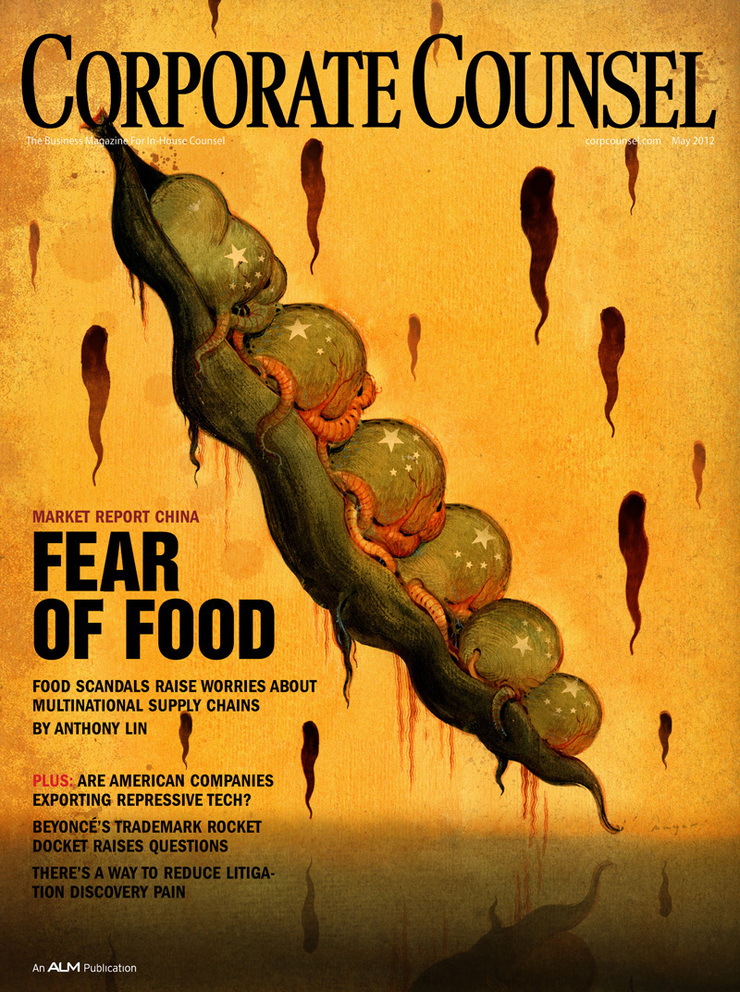
This is a horrifying little story about the problems with the quality of food supply in China for both the Chinese market and for the countries to which it exports food products, like the U.S. Food scandals have made consumers here and in China nervous, and they’ve also gotten the attention of multinational companies that operate there. Many of these companies have opted to manage their own foosupplies by policing and auditing them. Some pretty shocking examples that would make you literally sick. Crazy stuff. Morris Stubbs , my Art Director,wants a cover illustration with a 'dark tone' that goes with the story. ”Something a little shocking”. It’s like 'The Rotten Earth' that I did last year, a little gouache sketch of a blue face with soulless eyes bleeding a slimy black pitch…
"The U.S. Government had sufficient concerns that it opened an FDA office in China the first one ever established overseas. Progress has been made. But there are still huge concerns. One of the main sources for this story a lawyer who lives and works in Shanghai says that just about all the food he eats there is imported."


I talked it over with Morris and got started on thumbnails. I've always loved dark and slightly evil directions, like he usually wants. I did a dozen great little ideas and shot them off. They have a direction now, anyway.
- "Bill when you get this email give me a call, we like #8 "peas" but I'd like to work the China flag into the pod but softly and remove the faces and just have very disturbed looking peas…”
I did a sketch of the peas with out the faces. It was so bland. It just seemed like there was no concept anymore so I called Morris and tried to sell him on putting the sculls back in… He said they still felt that it made it too personal, like it was the Chinese people doing this and not the powers in charge. He advised to just make the peas look nasty and deformed.
After he let me know he could give me a few more day, I started thinking about how I was going to salvage this. At least I had a bit more time to procrastinate. Instead of a the Friday deadline I had til' Wednesday…
I half-heartedly made a stab at painting the illustration early Friday, But it sucked (seriously), so I opted for a nice walk and some climbing with my friend Goñi…
It’s spring here in Atlanta and it’s truly one of the most beautiful places on earth… Meanwhile, I was still trying to think of a visual way to salvage this illustration.

One night over the weekend I was drawing in my sketchbook and I came up with a kindof alien version of the pea pod. I figured this might be what it needs. It was more or less the “Invasion Of The Pod People” in my head…I was eager to get into the studio and paint this. I woke up early and headed in around 6:00 am I have the painting done by noon and started scanning it in. Another few hours of editing and tweaking digitally and it’s working pretty well.


Goñi dropped by the studio to see what I was up to and I showed him the thumbnails. He liked the oriental face down in the lower right corner. He said I should do that one too! According to him, it would only 'take fifteen minutes'. I still had til' Wednesday so I figured what the Hell. I got right in on Tuesday and started on two more versions, including one I wanted to do a brush drawing on a red background.


I figured this could be a really strong cover and worth the extra effort to see what it will look like. It ended up taking all morning. Then after lunch I jumped on starting the face. It took about two hours…
I just put a spot in the middle of the eyes with the stars from Chinese flag.

Wednesday morning I sent everything off for Morris to approve. He never responded on the other two concepts, just the original. He like it but the editors felt its was too scary and that I should get rid of some of the tentacles. While doing that I ended up getting rid of some of the strange alien sex parts my wife Lee pointed out, in the process . It ended up working pretty well so I send it off!
After one final round of slight adjustments, trying to make sure it read with the type well. I Really happy with the way the final one was working,it's still my favorite, but started wondering how the art director felt about the final result. I wasn't sure if he did or didn’t like it because I tried so many other directions did that give him the impression that I was not satisfied with it? But really that was not the reason. I always wonder how one of the other ideas will turn out.

Later on I replaced the spot on the oriental face with a nasty fly. I liked the fly so much I ended up going ahead and scattering them all over the face. It certainly worked better conceptually. Another fun little illustration. I comped them up to see what the other two would look like as covers too. Well, I definitely still like the original, but I don’t know now …”The Flies” just kind of work….

 I thought about a story an art director from Japan was telling me some time ago. We were working on a calendar together. When he was a child growing up, Japan was still very closed to outside media in fact it was the early sixties before they had their first live broadcast from the United States. Hard to believe it now with live images streaming in for all over the globe.
 He said it was a really big deal for them when it happened. He was in early grade school and they had been talking about in class for a month. There were announcements all over Japan about this huge event. Everyone was so excited, especially him because he had been chosen in his school to turn on the TV for the broadcast, He was so thrilled to be chosen from his class to given this honor. They all gathered in the auditorium and waited for the time to turn on the broadcast.
 As they all sat waiting for the very first images to show up the TV flickered and rolled. A Sweaty smoking American appeared on the screen and announced… What came instead was the unthinkable…. Pandora’s box was now open and the world would never be the same.
 I wondered about this if it could be true so I did a little fact checking. In 1958 only ten percent of the households in America had Television. On November 22nd 1963 there was planned a prerecorded statement from the President of the United States to the Japanese people. On the very afternoon of his assassination, networks planned the first trans-Pacific telecast -- a pre-recorded segment of President Kennedy offering his greetings to the Japanese people…Instead of the greeting they received news of the tragic events unfolding.
 Hard to believe now days when we get live broadcast from planets in our solar system, When Daly tweets of news around the world are just as routine as a cup of coffee. I can see the parallel between his story and Pandora’s box. I see the fear of trying something new, trying something unexpected .You might fail miserably, but maybe you just might stumble on something new…. and if you always do the same old thing and never open the box all of those scary wonderful things might never find there way out…. I went back into the dark room and closed the door. It was still so black, but this time my eyes saw color.
 When Prometheus stole fire from heaven, Zeus took vengeance by presenting Pandora to Epimetheus, Prometheus' brother. With her, Pandora was given a beautiful container, which she was not to open under any circumstance. Impelled by her curiosity given to her by the gods, Pandora opened it, and all evil contained therein escaped and spread over the earth. She hastened to close the container, but the whole contents had escaped, except for one thing that lay at the bottom, which was the angel of Hope named Astrea.