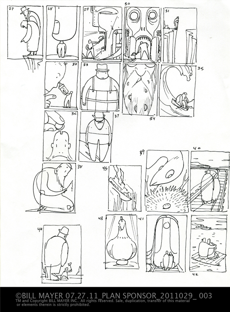
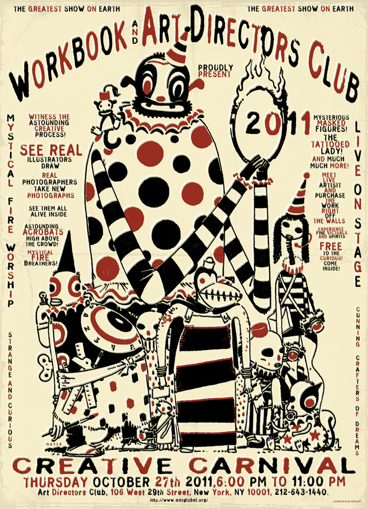
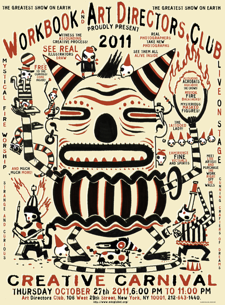
From the very beginning when I got this email from Blake this project looked like it would be a ton of fun. We had to cancel our trip to Canada because of some horrific personal stuff, so what better way to distract yourself from the daily horror than to immerse yourself in work. Well, it’s just how I tried to deal with it. I mean, if you're working and thinking about work, you can sometimes escape the other stuff. Well not really, but worth a try...
Blake’s idea was to intersperse illustrations and photos throughout the article and to use different styles to add variety to the layout. For me, it was a blast to be working in several different techniques.
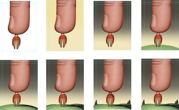
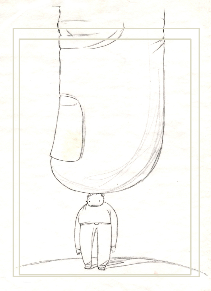
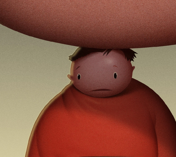
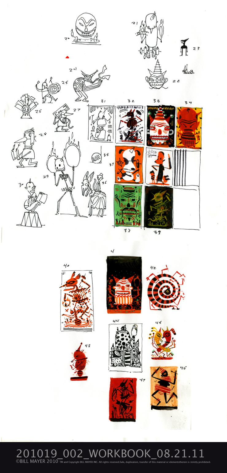
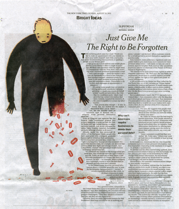
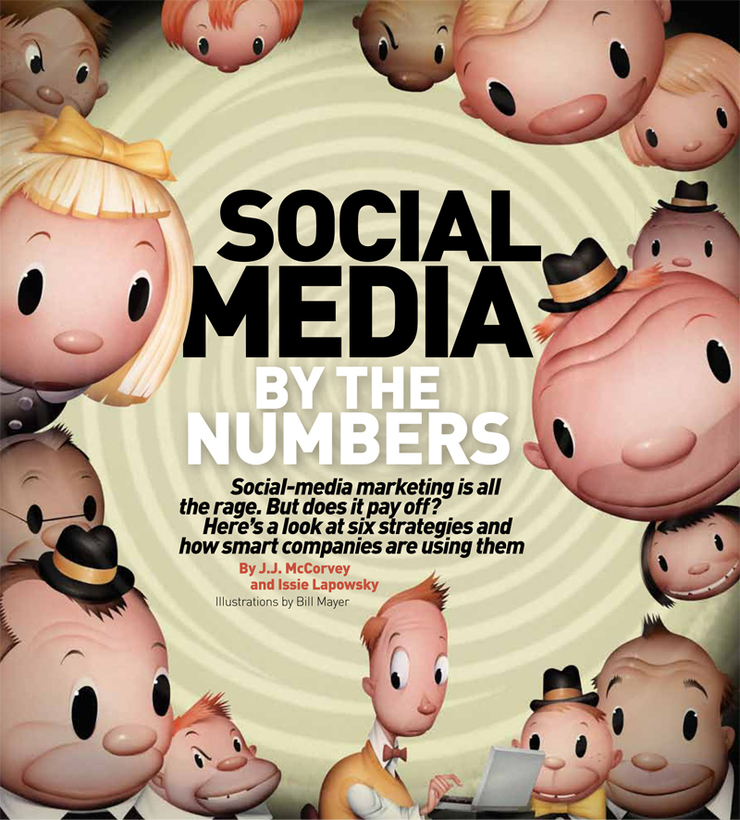
The article was about promoting the use of “Social Media” for your business... What works, what does not. Some really good stuff that all of you probably know and use all of the time. For the opener, he wanted airbrush. This illustration started off as a small spot and sort of grew like a virus all over the page. I loved the characters and layout but underestimated the amount of time it would take to get this puppy finished. SO, I procrastinated and of course put it off till the end. On to the thumbnails….
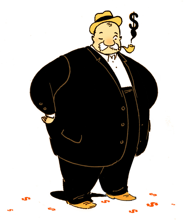
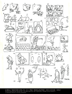
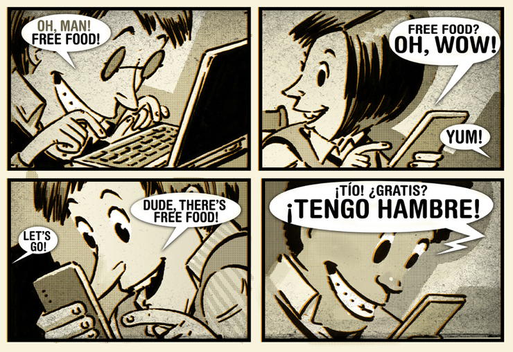
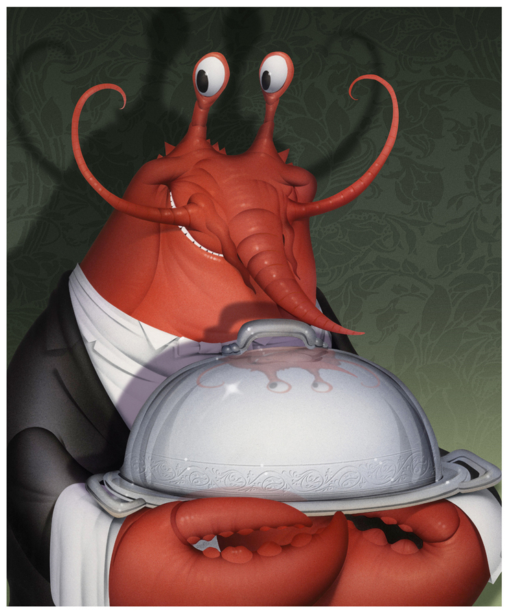
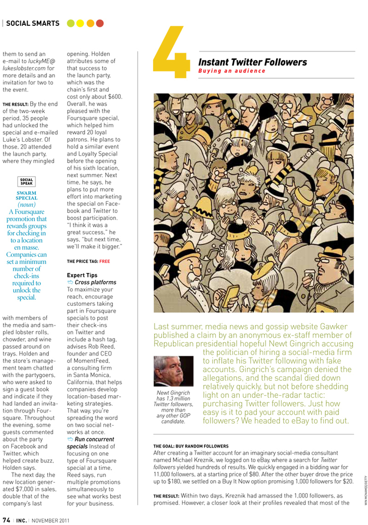
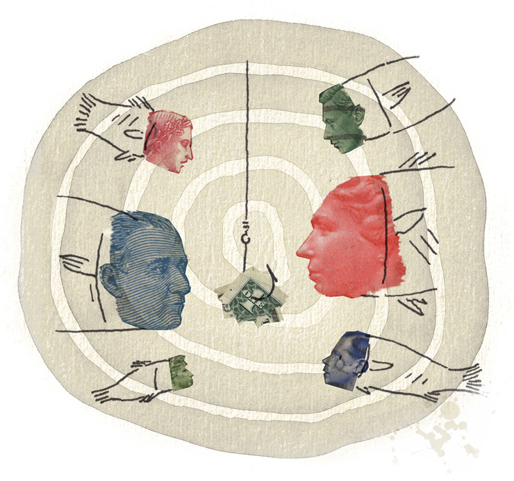
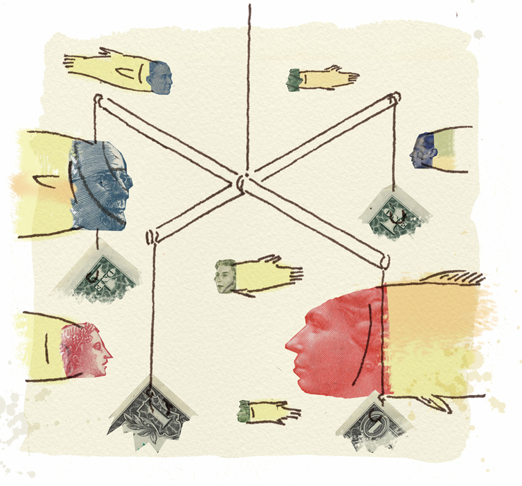
Damn. I like the birds, but the concepts worked as people as well. Blake agreed this was probably a better Idea.. He wanted a little comic illustration for one of them, kind of a limited-color thing like “Bebo.” My original idea was to do something with Facebook; every man silhouetted blue, but the comic was easy enough. Blake said "just make it about “Free Food" or something.” That works too. A little collage drawing for the “Paid Referrals” so a money collage thing made perfect sense. I did a few little thumbnail sketches and decided that the collage thing just needed to be put together to read right. I did two versions of this actually in the same file so I could share the little stamp heads .One with multiple hooks, one with one hook. I had thought of the multiple hook things on another little job and was looking for a home for it. Ultimately the single hook was simpler and I liked the bull’s eye of watercolor behind it. The crowd, well, a little different story. I came in Saturday morning to get a bit of a head start and my original idea was to do a copy-paste crowd, but when I started drawing I just loved the kind of retro feel of the crowd so before I knew it I had drawn them all out. I sent off the line sketch final for Blake to see but of course he’s not there on Saturday. I just started playing with a little color treatment and oops, that was finished, too. Oh well. Send the color off and hold my breath... I am thinking, I will either be way ahead of the deadline or I will be fucked. Either way I liked the drawing too much not to try to sell it. On to the forth spot, “the Lobster." This was Blake’s idea; he just wanted me to do one of my characters. Airbrush characters are time consuming, but this little guy I thought worked pretty well. Add some wallpaper in the background and off to the opener. EEEK! The opener I had been procrastinating on! Oh well, time to dig in…. I loved the sort of pop stylization of the characters. I've been doing these illus. long enough to know this is going to take time. They just do. Ultimately a few tweaks in the racial diversity dept. and we’re done. Looking back I think the comic could have been not so “goofy...” the lobster character could have been funnier. But all in all they worked pretty well.
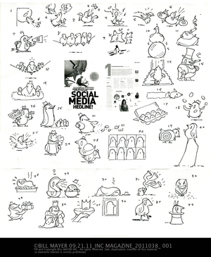
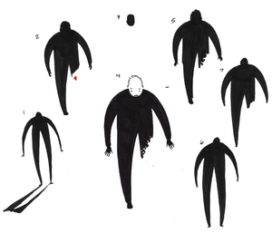
My first round of thumbnails I was trying to use some unifying theme like a bird throughout the spots. I guess I was thinking that direction because of the “Twitter” thing but felt that really made the whole thing slanted toward Twitter so we scrapped that early and went off in another direction. Damn, I liked the birds, but the concepts worked as people as well.
I used some of the ideas I liked from the first thumbanils. I think they worked even better using some of the cliche's from the birds and converting them to people. I think all of these concepts were just too all over the place but we narrowed in on a few, made some changes, and picked ones that were working and forged on.
He wanted a little comic illustration for one of them, kind of a limited color thing like “Bebo.” My original idea was to do something with the Facebook "every man" silhouetted in blue, but the comic idea was easy enough to pull off. Blake said, "Just make it about Free Food or something,” so I figured, hey that works too.
.
On to the forth spot: The Lobster, which was Blake’s idea. He just wanted me to do one of my characters. Airbrush characters are time consuming, though this little guy I thought worked pretty well. Add some wall paper in the background and off to the opener.
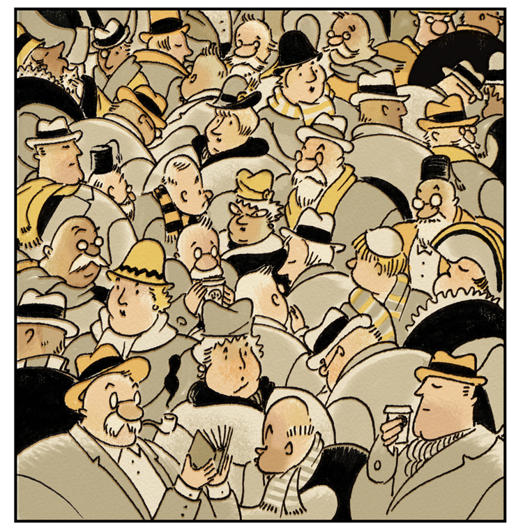
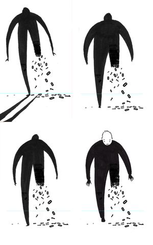
I loved the stylized kind of 1940's characters... I had been playing a lot with those, lately, and this seemed like a great place to put them to use. Certainly a bit more work than the copy paste thing I thought about first, but they just felt right.
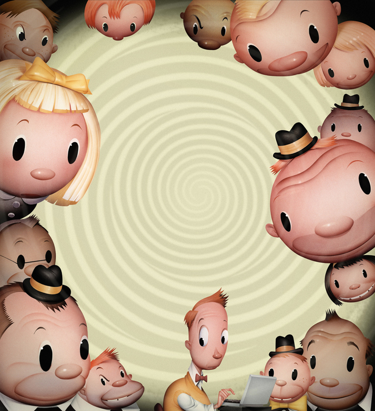
My forties looking crowd was rejected because it needed to better reflect a more random and diverse group of twitter followers.I still like them.
I am fucked. Blake likes the collage but thinks the crowd is not diverse enough to show Twitter followers, and a really random section of crowd, that is what is important, so back to the drawing board. I just used the same basic crowd and drew the new group over them. It went realy fast and I tried the same color treatment. and tried a limited color version, I think this will work just as well.
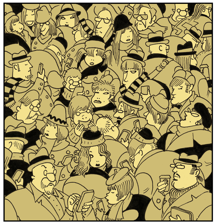
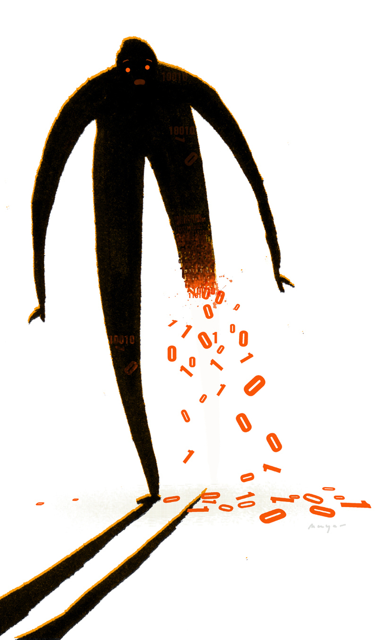
THE NEW DRAWING LIMITED COLOR VARIATION...
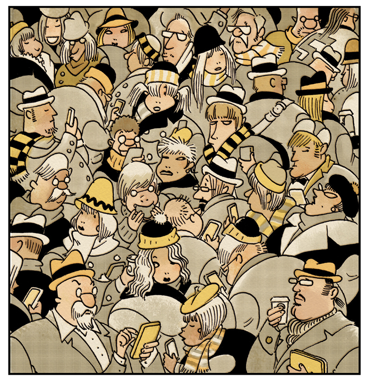
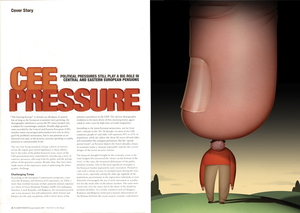
THE WINNER, For Inc Magazine © Bill Mayer 2011
Collage work for me has always been really spontaneous and done just in sketchbooks, not for cients, so I have been trying to figure out how to make this work. Seems like there is not a sketch that would adequately show how it works, so I opted to just put a few together and see what worked the best.
The Winner
Of all of the little collages this was my favorite by far. I guess I could have made that call and just sent one. but I really wanted Blake to decide which one worked best with his layout. After all, it's supposed to be a collaborative effort, right?

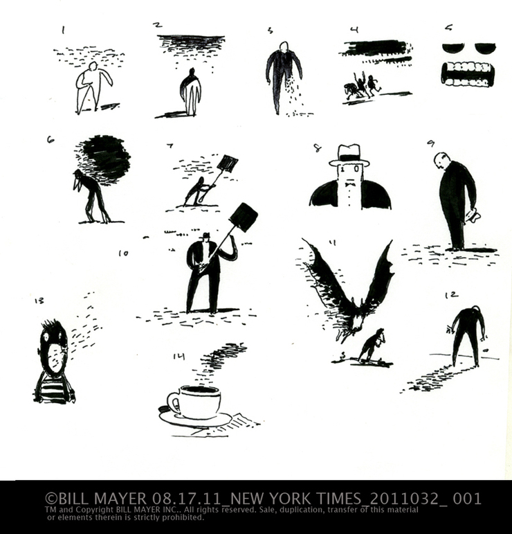
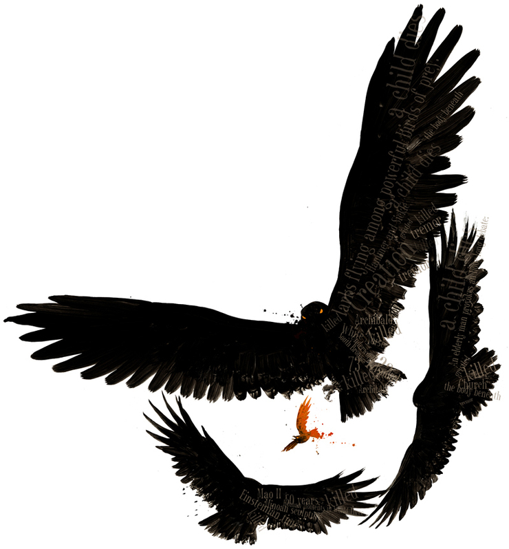 Here's another great little editorial piece for The Boston Globe. This little e-mail came in on a Saturday. Normally not in on the weekends but I was finishing up some illustrations for Matell and needed to tweak them out before Monday. So got this little note from Illoz, ( Thanks Zimm, it's working). Called to actually turn down the job because it was a little tight with the deadline, needed final by mid day Wednesday. and it's Turkey week. I am already covered up. But while I was waiting for Jane to answer I read that little blurb in the copy and the visual was right there and so intriguing. Here are my first thoughts on the thumbnails... they come mainly from the line in the copy that reads: "they are larks flying among powerful birds of prey." I'm thinking to somehow working words and/or text into the illustration, (ie. birds made of text..) Probably use some sort of spot color, to contrast with the black, and draw attention to the lark.
 Jane said she would rather have a free-floating image. I had this image in my head from the very beginning but I always play around with thumbs to see if there is anything better. Turned out pretty much like I had seen it from the very beginning. I spent a moring on the final; just pulled some Rafter reference together and of course a Lark. I tried and certainly wasted several hours trying to fill the big birds with text but in the end decided to scrap it for a simpler version.
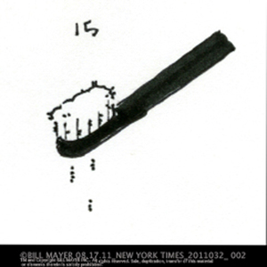
 I love how these little brush drawing look blown up, Just hoping some of the detail holds up....
.
I love how these little brush drawing look blown up, Just hoping some of the detail holds up....
.
 Unbearable Lightness of Being... Here's Jane's very cool design. Love how the birds hang at the edge of the type.