
 I have a long time friend and great designer, Rick Anwyl, and it was such a pleasure to work with him on this project. He has been familiar with my stamp drawings since I started doing them and always wanted to find a way to use them. This certainly seemed a perfect match of intelligent application and clever design. These little drawings' ultimate use was for a recruitment brochure for an old Boston financial advisor, Cabot and Moore. Each spot was to represent an atribute and spark a memorable piece that would set them apart from the norm. A big step for such an old prestigious firm. A step that takes a lot of trust with clients and design firm.
 We started off doing samples of styles and settled on two diferent directions, One, the stamp drawing, and the second a playful use of the 40's New Yorker style I had been playing around with. But from the very beginning I think Rick wanted to use the stamps. Noone else has figured out how to make them work in a campaign or brochure or any application since Piauí picked up one of my sketchbook drawings and used it a year or so ago. It was a smart direction but we ran into snags trying to work out how to get the client on board.
 I did a few tests of stamp drawings and one of the little spots of the 1940's New Yorker style...Seemed like they were not quite getting there conceptually, so we went back to the conceptual stage and did some little thumbnails and picked a direction... did a few more little tests to show the client. Rick put together a dummy of the booklet and ran both styles past them.
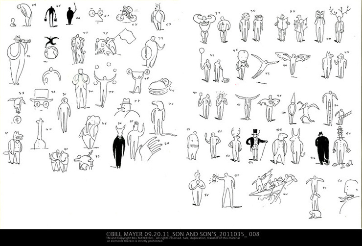
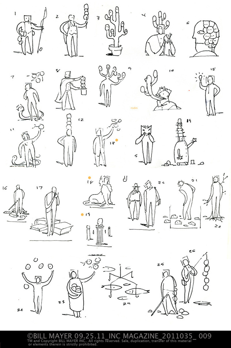
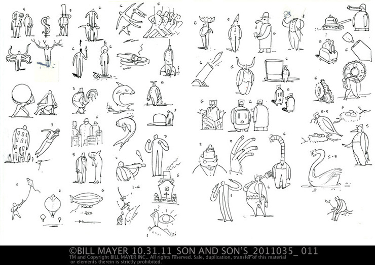
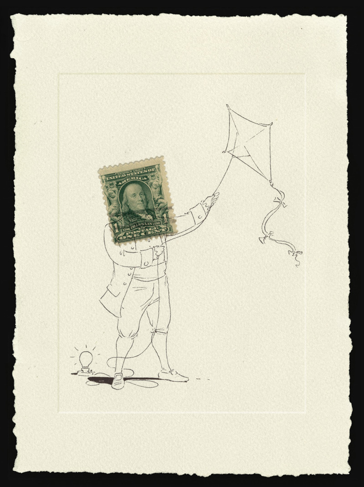
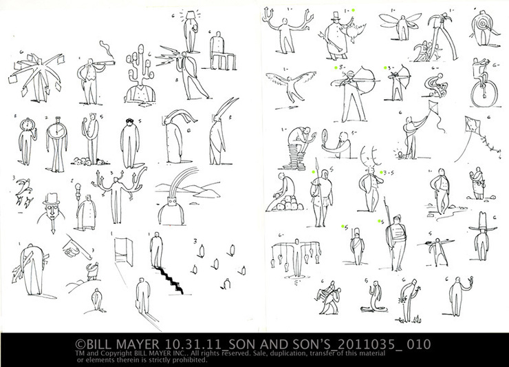 I did bunches of thumbnails... As you can imagine, I sorted the ones that were working out and sent them to Rick for his comments. He and whoever else was sitting in made their choices and I did a little thumbail version of the stamp drawings so I could try to keep from doing multiple versions of each concept and try also to keep some freshness to the final drawings.
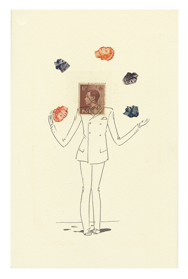
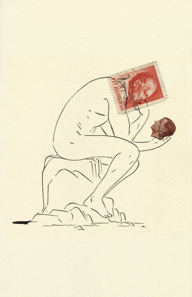
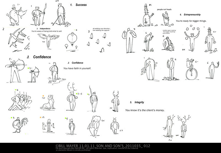
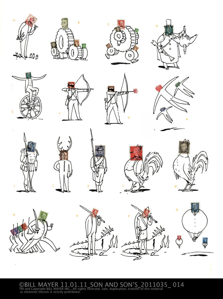 Ricky gave me carte blanche with these, to do anything I thought I wanted to try but ultimately I tried to keep itsimple and not do anything that would interfere with the play of the stoic little stamps and the clever little line drawings and how they work together.
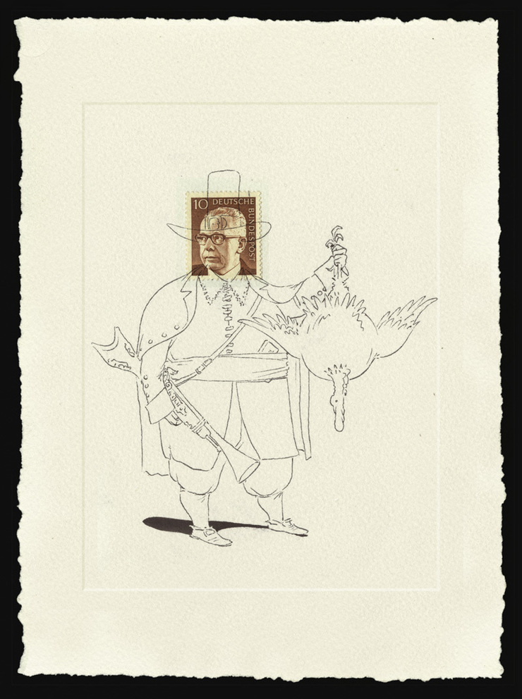
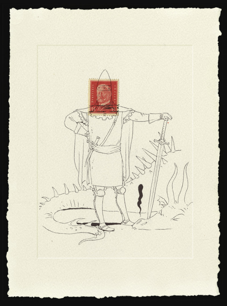
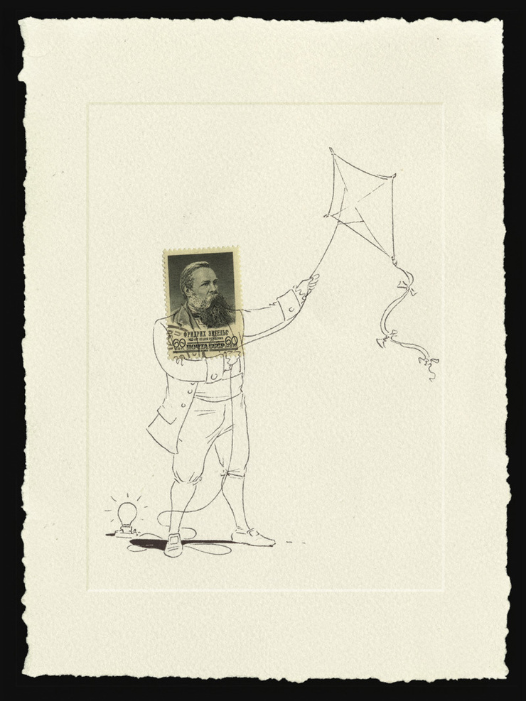
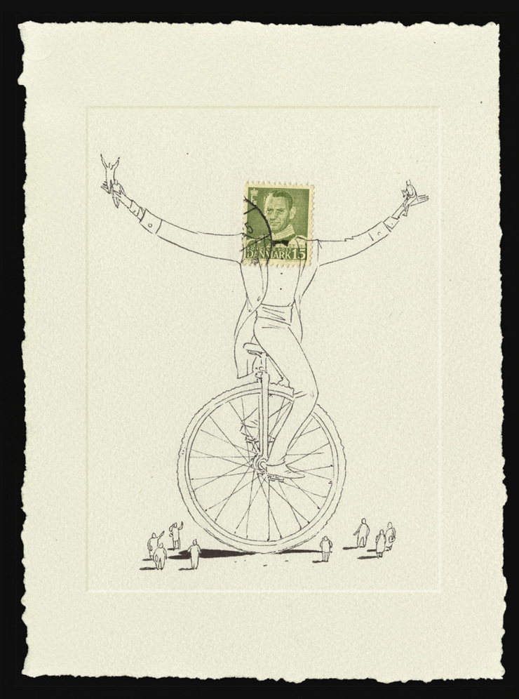
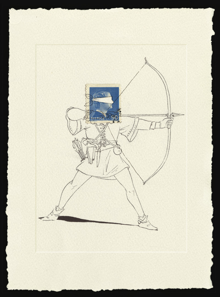
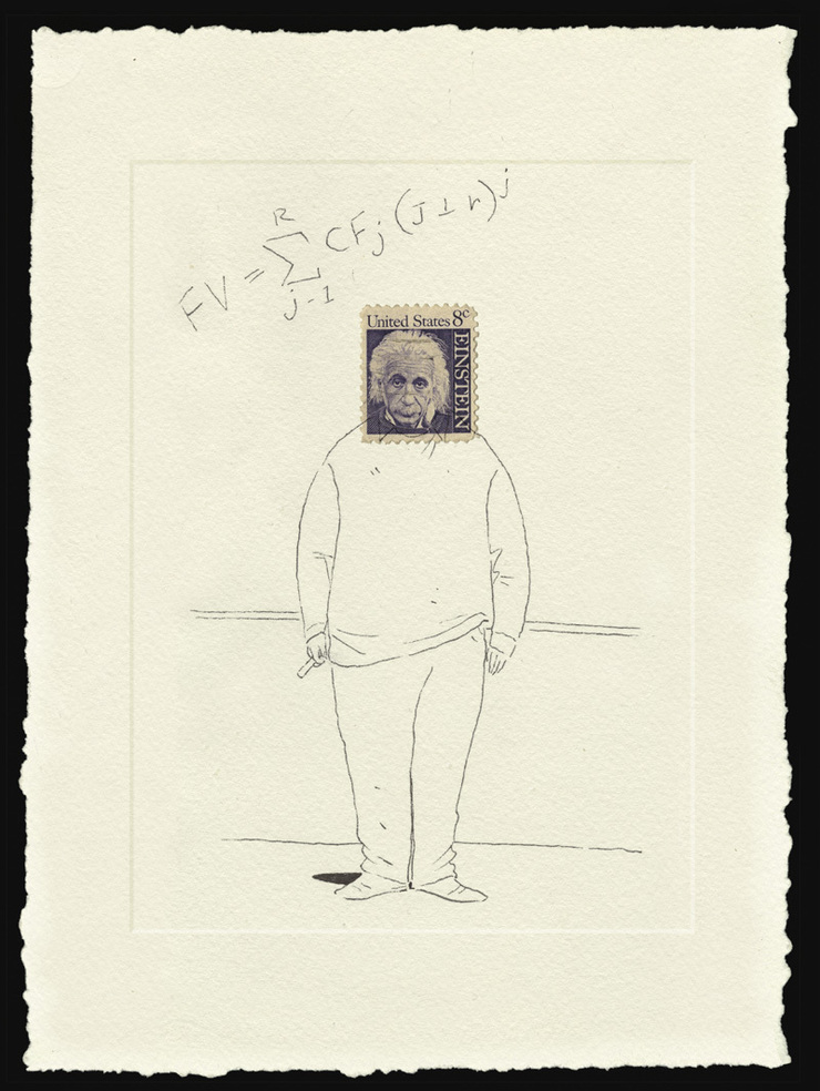
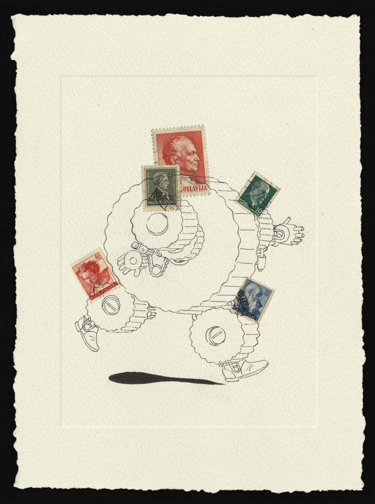
 I almost redrew these little drawings... They were a little too tight for me but it was questionable if the looser drawings would be better or not. They seemed to work pretty nice the way they were.