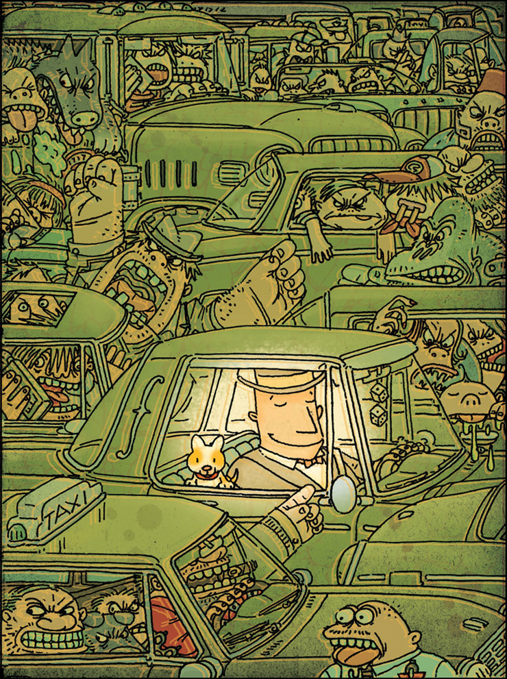
When Mathew Willis / Blue Print Partners, Amsterdam called me about working on this project , it was a simple reuse of some illustrations I had for a project with Shaun Hawk, at McCormick. Blue Print is a Public relations firm who were given the task of trying to come up with a brochure to help sway public opinion about pending Euro legislation that would curb pesticide use . It started as a single page comic in the form of a direct mail piece. We went over the project and decided to produce a little underground comic instead. Address the pending legislation, twist the story a little, as rising food cost. Since they didn’t have an art director I assumed that role and along with a writer Robert Roth we adapted the existing bugs and a couple of new ones into a story line . The Bugs would go on an eating holiday across Europe. Although the original copy reflected more of a world domination theme that was a bit scary to the Euro market so the eating holiday won out.

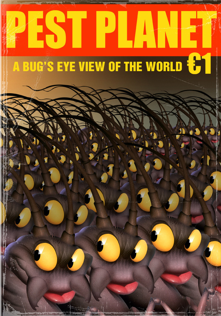
Original bug developed for a series of trading cards, promoting Dupont. (Agency: McCormick, Art Director: Shaun Hawk), and then how it was developed into the "Pest Planet" cover. © Bill Mayer 2010

http://drawger.com/billmayer/images/1591741707.jpg

page layout, and rough comps. Trying out some different names. Showing how the existing bugs would fit into the drawings.
Expiramenting with different variations of names and images for cover illustration. I really liked the idea of "Bugs Life" but kept thinking "This sounds so familiar!" until we remembered the movie of the same name... So we settled on "PEST PLANET."
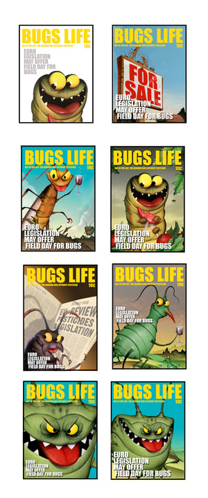
These are low res comps just to give the director an idea of what the cover could look like..
Some of the other possible names for the comic included:BEE-BOY, HONEY BOY, THE BEE’S, B, BUTT MUNCH, BEE-BO, BUGO, BUGGABOO, BUG OFF, BUGGER, CRICKET, TWITTER, CREEPY, CRAWL, SWANK, INSECTO, INSECTO-RAMA, BUG BOY, BUGGY, PESTO, PEEVE, VEX, MICROBBE, BUGO-RAMA, TASTEE WORLD, THE STAND, BUG LAND, BEE-TLE BOY, INSECTIVOR, FUTURAMA, HOUSE AND GARDEN, LADYBUG JOURNAL.
What we were trying to do was create this, kind of, underground comic, that would be something people would find at coffee shops, and sit down and read... Create an awareness of the problems that the rising food costs could create..
Yeah, yeah, I know.. Working for the man...

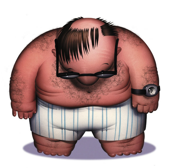
 Tim wanted a brighter background, and while I was changing that I pulled the new type in and inadvertently found a better cropping and sent it to Tim. I sent it to him, because I liked how it sort of let the guy get a little bigger, and seem to add a little motion to the illustration. It also got rid of those feet I was having trouble with....naturally © Bill Mayer 2010
This cover for Mother Jones started as an inside illustration, full page of this little guy. When I did the thumbnails I already had something in my head, so just a few little thumbnails to get the idea on paper. Tim thought he should not be quite the heffer of a fat cat, so we slimmed him down a bit in the sketches. They wanted Him to look a bit more like the Monopoly guy....but not too close.
http://drawger.com/billmayer/images/3352830964.jpg
Tim wanted a brighter background, and while I was changing that I pulled the new type in and inadvertently found a better cropping and sent it to Tim. I sent it to him, because I liked how it sort of let the guy get a little bigger, and seem to add a little motion to the illustration. It also got rid of those feet I was having trouble with....naturally © Bill Mayer 2010
This cover for Mother Jones started as an inside illustration, full page of this little guy. When I did the thumbnails I already had something in my head, so just a few little thumbnails to get the idea on paper. Tim thought he should not be quite the heffer of a fat cat, so we slimmed him down a bit in the sketches. They wanted Him to look a bit more like the Monopoly guy....but not too close.
http://drawger.com/billmayer/images/3352830964.jpg
 Where Have All the Whistleblowers Gone? Get Out of Jail Free Cards.... Big Wall Street Banks take a walk around the board on the tax payer, and Washington does not have the balls to let them all go belly up. "When President Barack Obama's jobs bill passed the House in early March, it contained a little-noticed provision to recover part of its $35 billion price tag by cracking down on offshore tax evasion, which costs the US some $100 billion a year in lost revenue. The provision, which requires foreign financial institutions to report more data to the Internal Revenue Service, was likely prompted by a 2008 Senate investigation that revealed the systematic efforts made by Swiss bank UBS to help moneyed Americans hide massive sums from the IRS." Well basically we are still suffering through the remains of these actions. and it looks like several more years before we may recover.....if ever.
 Thumbnails for the inside illustration, not so many I just loved this really fat cat business guy with Uncle Sam under his thumb, but the editor wanted it to look like Sam and the cat were snuggleing up. They chose the up-close-in-your-face version. "C". © Bill Mayer 2010
 Sketch showing the changes to the attitude and posture to make Uncle Sam look happy..© Bill Mayer 2010
 I got this note from Tim the other day; thought I'd pass it along...
The Jan/Feb cover you illustrated is currently not only projected to outsell the March/April 2010 issue, but if the current numbers hold, will sell better than every one of the 2009 issues; so thanks for your great work on that! And I believe those stories (with your outstanding lead illustration) have gotten a good amount of exposure, both the print and online versions; so thanks for that too!
I’ll definitely look at your drawger posts. Love that site.
Best, Tim
I got this note from Tim the other day; thought I'd pass it along...
The Jan/Feb cover you illustrated is currently not only projected to outsell the March/April 2010 issue, but if the current numbers hold, will sell better than every one of the 2009 issues; so thanks for your great work on that! And I believe those stories (with your outstanding lead illustration) have gotten a good amount of exposure, both the print and online versions; so thanks for that too!
I’ll definitely look at your drawger posts. Love that site.
Best, Tim