Monday, May 23, 2011

The Dead Mimes

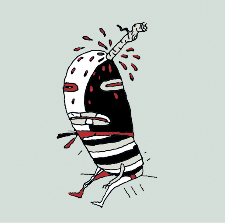
I was recently on my old website and ran across this little series of drawings I had done some time ago. I had beed playing around with putting together some more little mock-ups last week for meetings with publishers. wednesday I wrote a little copy to go with them, and comped it up. I thought it turned out pretty funny. I edited the mimes down to half the number, probably needs to be edited and cut down again, but thought I would share it. Thought about using that little name we came up with for the bad egg... Edgar Oddskin.... liking it a little more.. Enjoy. http://issuu.com/billmayer/docs/deadmimes1 Cover Art. © Bill Mayer The Dead Mimes started out as a series of little thumbnail drawings for a good friend Rick Anwyl, who at the time had asked me to draw a harlequin clown for an Art Festival in Atlanta. I think he could not have imagined what would pour out of my little brain. We had just been silently been assaulted by mimes on the steps of the Metropolitan. The rest is a very disturbing cry for help and a long extended stay in a mental asylum.

Friday, May 20, 2011

The Great Deluge

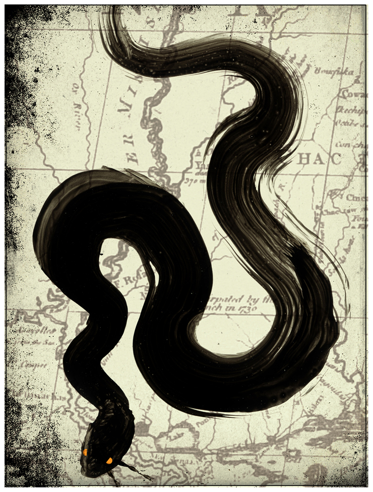
I woke up this morning to more depressing news about the floods in Tennessee, Mississippi, and Louisiana. I thought of that old Cotton mouth as a metaphor for the Mississippi, large, swollen, and menacing... As the waters reach New Orleans I just couldn't help thinking, Where will those Cottons Mouth all go? Looks to all of us in the South this flood could be a catastrophy unlike any of us has witnessed before. Waters reaching 50 feet above their normal flood ranges. I recently heard that the Akansas River is now flowing backwards. On Tuesday, May 10th, the Mississippi River crested in Memphis at nearly 48 feet, just short of its all-time record of 48.7. It has destroyed houses and massive crops of cotton, rice, and corn. Damage in Memphis estimated at $320 million, but the official tally (probably much higher) won’t be available until the waters go back down. More than 1,500 square miles of farmland in Arkansas, which produces about half of the nation's rice, have been swamped over the past few weeks, and the economic impact will be more than $500 million, according to the state's Farm Bureau. There has been one reported death, but more will likely surface when the waters go down. (still no estimate as to when) Most devastating flood since the “flood of 1927. (record high of 56.3 feet)” See pictures of the devistation and aftermath @ http://www.boston.com/bigpicture/2011/05/mississippi_river_flooding.html

Thursday, May 5, 2011

Staying Sharp #7

Okay a great way to stay sharp, take an object from your studio and do ten sketches :10 min.... for me;.. a fork works..... Right brain thinking....So it's a little exercise I started when I was in art school...Doesn't have to be brilliant, just a great way of staying fresh and keeping the ideas flowing. Honestly, this little set of drawings only took :10 but then another 20 minutes or so to scan them and figure out how to post them....but you get the idea. All Material © Bill Mayer

Friday, April 15, 2011

All Bundled Up

I know this image is very direct and simple, But I loved the colors and the moodiness the black gave the illustration. © Bill Mayer 2011 Sept illustration for SooJin Buzelli at PlanSponsor.. This article's title was "All Wrapped Up." It was about bundling services in your retirement plans. The initial thumbnail direction went with the bundling idea, but they were all in the wrong direction as far as the concept. She said "Sorry I wasn't clear about the "bundled" concept. It's more about having all services from one place. Bundled service. Can you focus on bundled coming from this direction? Having everything included. All service from one place." SooJin put me on the right track and this is actually the the second round of thumbnails . Much better direction and this round had a few that I thought could work. SooJin asked me which one I liked, and being all wishy washy I put it back on her. She picked the three directions she liked and I tightened them up a bit so we could decide. She asked me again which one I wanted to finish and again I couldn't make up my mind, so used to having someone tell me what to do. Lee never asks me what I want for dinner, she just puts it down in front of me. I mean, making up your mind is hard when there are so many good choices. Finally, tired of waiting for me to assert myself, she picked the man with the drawers. There are so many ideas on this sheet of thumbnails I can't wait to find a place to use a few more. © Bill Mayer 2011 Now I have to forget about the others and hurry finishing this little drawing. I did a final sketch, asked if she needed to see it and she said she didn't. So on to the final. This little spot went really quick. I did the figure in airbrush and the rest in Photoshop.It just felt right to put it on a dark background. Made it a bit more moody. Being done early can be a problem so I tried some different backgrounds, Let it sit around for a day or so. This is not a luxury I am used to having. Most of the time deadlines are looming and help curb the indicision. Anyway, I was thrilled to be back on one of SooJin's little post-its. All and all i think the little spot turned out pretty cool but there are a couple more of those ideas I still want to bring to finish.... Here are the three direction SooJin picked to tighten up. © Bill Mayer 2011

Monday, March 28, 2011

Jazzoo 2011

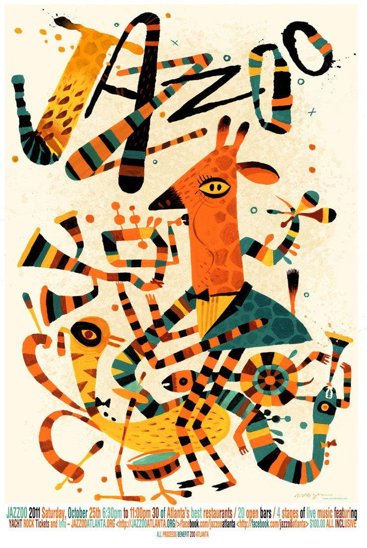
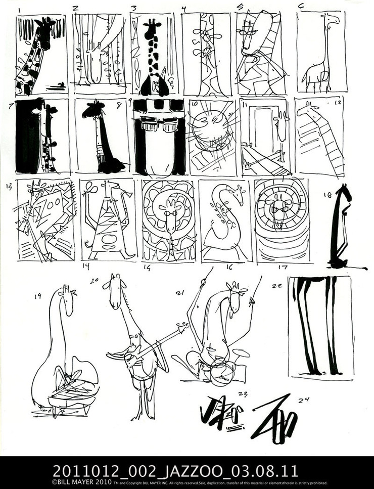
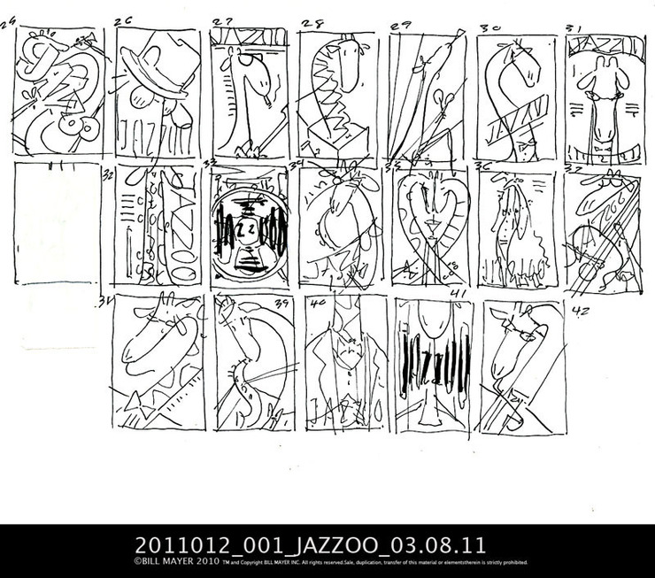
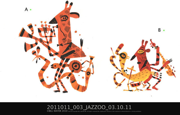
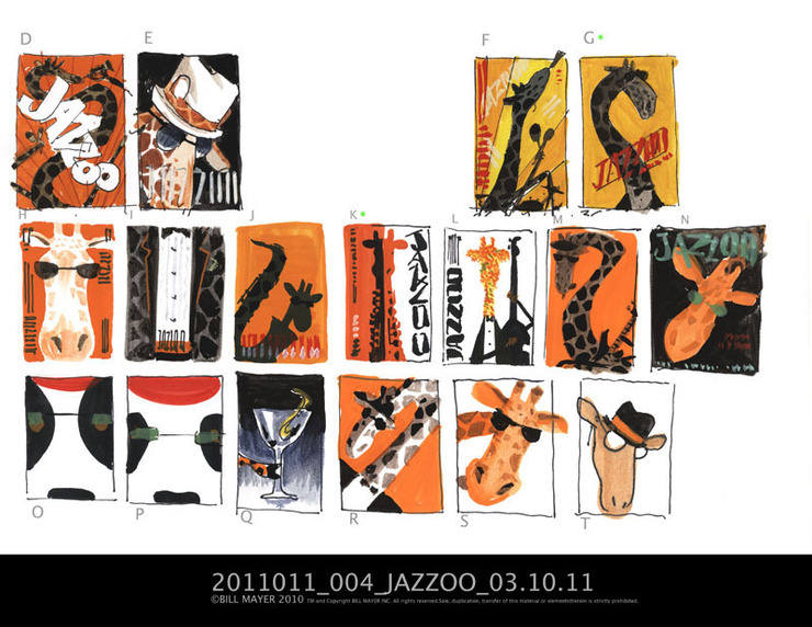
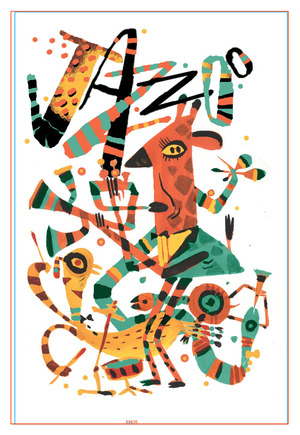
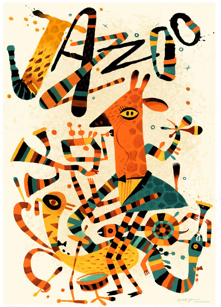
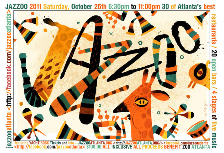
Here is the final poster with the type I decided to just put on the bottom. the poster was so busy i didn't see how to add it into the face of the 24"x36"poster. © Bill Mayer 2011 If it's not apparent, JAZZOO is a fundraising event for the Atlanta Zoo. When I got a call to do this poster, it was pretty much an open canvas. Jeff Stewart, the art director, had gone through my fickr site and pulled off some old samples of "Blind Boys" and other samples of some of the more folk-art styles I had done a few years back. He sent them to me as a possible direction. I did the normal "bunches of thumbnails" exploration. They were having a lot of trouble understanding the thumbnails so I took a few and added color to make them easier to understand. As an after thought I did a second bunch of fun little folk art versions. Lee liked the folk art ones, but said "they'll never go in that direction..." It's great when clients act unexpectedly, and occasionally, it can make for some fun outcomes. colored a few thumbnails to make them easier to understand. My after thought on thumbnails. We all loved this direction but were convinced that the client would not go this way..© Bill Mayer 2011 Part of the direction was that the poster had to be of a giraffe. I really didn't think about it much before I started, but that long neck became quite a problem. Tried everything I could think of to work my way around it; hooking it around, over the top, or just cutting it off. I think that is why, when it came to the little folk art versions, I decided to just " Picasso" it and ignore the long neck and move the mouth down and make it into a little face. This worked out better than I had hoped. They loved this direction and their only comment was to make the drawing more colorful. So I took the little thumbnail and comped up a version with the colors close to the way I thought it would work. then printed it out and painted over it on the light box. worked pretty well. This is the little comp I did, pulling all of the elements from the thumbnails together and organizing them to get a clearer idea of how the drawing would work. Some of the final editing came through after the painting was done to make it read better .We opened up the distance inbetween the characters and the type. I had initially thought about hand doing the other type until they sent me final copy. too much to squeeze into the illustration , Which seemed crowded already so I put the Type at the bottom.This will make it easy to edit as I am sure the copy will change several times before we go to print. When I posted this on Facebook last week a couple of people mentioned a nod to the modernist. I really wasn't trying for that but when it was all finalized and put together it did remind me of one of those great cubist circus posters they used to do back in the 1960's. I can definately see some Flora infulence. Some of their wacked out cubist drawings are just so inspiring. My grandson Forest said, "Oh, retro Bill Mayer!..." I guess he's remembering those old scatchboard drawings I did of the birds ......the skeleton and The Blind Boys of Alabama.... HERE IS THE POSTCARD VERSION © Bill Mayer 2011

Saturday, March 26, 2011

Dellas Graphics; MORE FROGS?

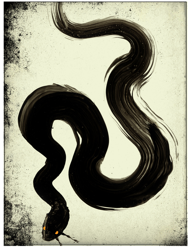
I had a little more time, so went back to a technique I stumbled on last year. These little brush drawings were a lot of fun. There was another thumbnail of a snake and a frog so, rather than doing another airbrush or line version I thought I would go back to the brush style. Although these turned out well, for me, they lacked the same excitement that happened last year when I discovered this little technique. In fact, they just seemed a bit too close to last years Death of Frogs Two....But still, alway a joy so why not share some of these as well. I did a half dozen of these brush drawings.Tried adding color and textures. Some worked better than others. I loved the cropping on this heron and the deep blue color. Tried some diferent colors and backgrounds.I think the one at the top was my favorite. I loved the really quick fresh brush stroke.

Thursday, March 24, 2011

Dellas Graphics, the King Frog

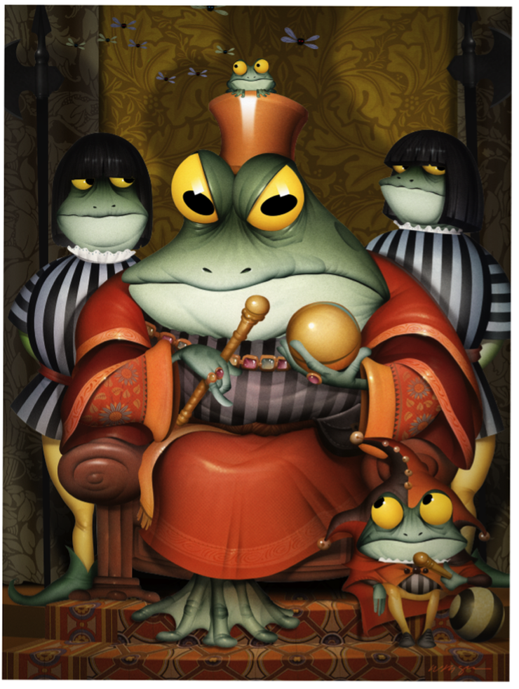
Here is the final illustration with everything put together....This illustration was so complicated I didn't see how the silhouetted figure in the foreground was going to work..... © Bill Mayer 2011 Always the highlight of my year, I can count on Jim Burke to come through with another opportunity for a new frog. This year, like last, it was just too hard to stop drawing new candidates for the calendar. Some in expected directions, some in the line style I have been experimenting with, and some revisiting things I stumbled onto last year. Truth be told, it's just an excuse to do some frog drawings just for fun. Started out with the normal thumbnail exhaustion.... Jim picked the king. I was not really falling in love with it, so another batch of ___ more thumbnails and we had one that seemed to work. Jim suggested putting a little jester in front, so I added that in the sketch. He clarified that he meant to put one in the front, standing. I tried this in a bunch of thumbnail directions... It seemed too complicated but I understod the Idea and ended up sketching them up and rendering them to try to make it work. In the final, though, it ultimately was like I expected. Just too distracting from the great charater study of the King Frog. I started with the sketch transferred to a board and airbrushed the Main part. Scanned the illustration in and cut paths and retouched. I start building the backgrounds in Photoshop.First with flat colors ,later adding shadows and detail.... Ugh to many stripes so I pulled in some textures for the backgrounds and rug on the floor. I used transform warp to pull the textures to fit my original sketch which I pull into the file and register. Adjust the colors in Hue.... Started adding more detail and decided to add some little flies hovering around his head.....more shadows to give the drawing some depth...Added some quick battle axes, done in Phototshop. Adding this little frog was completely an after thought, so I swiped some bits and pieces and made him out of several other frogs. The body from the jester at the bottom, and the hands from the King Frogs feet. Just transformed to make them fit better....Some buggy eyes and he's good to go. The King Frog, Dellas Graphics, © Bill Mayer 2011 Jim Burke really liked the idea of having the jester in the foreground, so I was determined to at least give it a try. I darkened the figure in the foreground and put several layers in between, lighting the background and creating some visual distance in between the two. Added a little reflected light also to cool down the foregound figure. Boy this was starting to get really complicated..... Maybe blurring the background image would help...Still not sure which direction to go with. So much fun, not sure when it's due either, but i'm sure we'll be doing changes until we ship it out. Hey Jim When is this thing due? I think this is Jim's final pick.

Wednesday, March 23, 2011

More Dellas Graphics Frogs

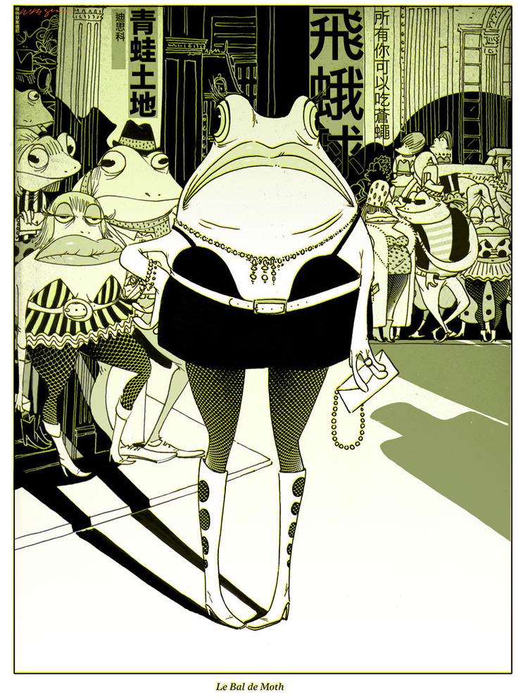
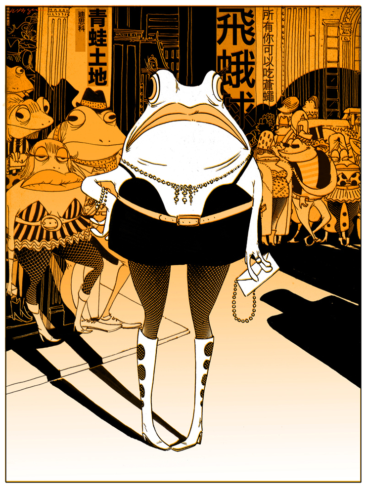
"Le Bal de Moth" © Bill Mayer Okay I know , but I just could leave this little thumbnail unfinished. I had originally thought of this as a bunch of street walking harlet frogs but I know they like to keep the calendar on the PG rating and just incase it turned out better than the king Frog .I decided to make it in to kind of a night time clubby thing. Like some Hong Kong disotequue. I had been playing with some line illustrations in December and I thought that would be a great style to explore a little more. Kind of pushed the concept in that direction. I really liked the stark Black line and heavy back areas.I was pretty happy with the way this one turned out. © Bill Mayer 2011 this was the first little comp I did on adding color. tried flushing it out ading some subtle textures in the background. © Bill Mayer 2011 tried it in Yellow.. tried it in orange... Just seams like it worked in any color that I tried. Bu tI still keeo going back to the Black line .... © Bill Mayer 2011 I really like the way that the strong Back and line work work together. I wanted to try some limited color treatment not to over power the line and yet give it a bit more atmosphere. I typed in to Google Tranlate a bunch of little things like "Frog Town Disco" and " All You Can Eat Flies" ...But I really have no idea what the type actually says. Just hope it's what Google said it was..... A coupleof friends now have said Aubrey Beardslye when I showed it to them, I just don't see it But I guess they're talking about the negative black areas and the detail ...Okay I gues I can see that.Well not really, But I did think it turned out Kind of cool. After letting it sitting around, I am thing I like the Black line as much without the color. That's the problem letting these things sit around too long. Starting on another direction....Oh no to many frogs ,time for something else....