
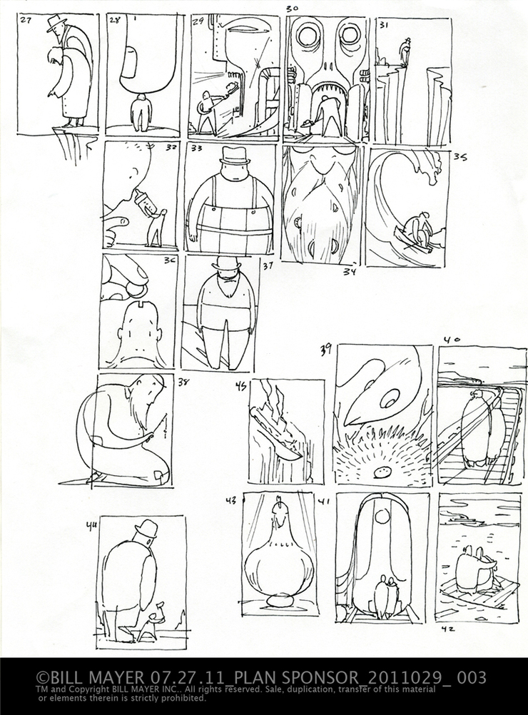
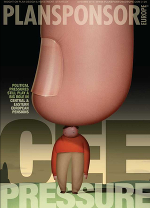
It’s always nice to ease back into work with one of SooJin’s illustrations. We had a great break on holiday at the cottage in Canada. Great to unplug a bit, turn down a few illustrations jobs and just get lost. Now that we’re back, Jumping right into the thumbnails is a great way to get back in gear. This article was about the squeeze Euro companies are feeling on their benefits and retirement plans. The first round of thumbs really dealt more with variations centered around retirees having the earth eroded out from under them ( 27). I set it aside for lunch and when I came back to it I liked these directions much better. Sometimes the most obvious directions work the best (28).
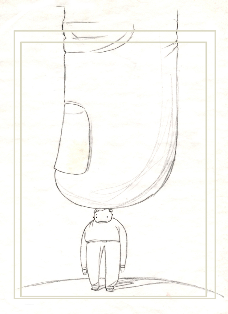
Final sketch before I started airbrushing...© bill Mayer 2011
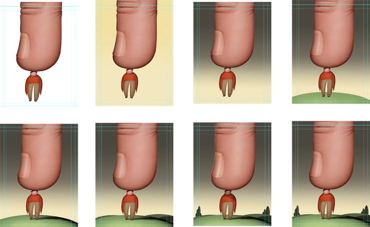
I tried several background variations before settling on this grey. It seemed to set the mood better than a blue sky. I likes the way it worked as a neutral pallet. The color gave the piece a bit more of a somber feel and attitude to such a silly concept.
Desk top copies of work in progress showing simple steps adding background...trees, hillside...
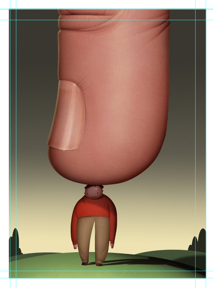
After transferring the image to illustration board I do the airbrush part of the illustration . In the past I would have done the sky and background as well, but now that they have to be delivered digitally I do a lot of the backgrounds a finishing in Photoshop. Tried a blue to yellow transition in the sky ,just was not working...I liked keeping the pallet warm but it just felt like it needed to bit moody... so I added a little dark grey to somber it up a bit.... added a little hill...trying to keep it very simple....Added some shading on the hill...feels like it needs a little depth and dark areas in the bottom... Shadow is helping...I used the path for the original outline and just transform / distort / warped it to fall along the hill top... added a few more hills to give it some depth.... and some simple trees to help add some dark areas along the bottom... a little noise in the background to match to texture of the airbrush.... I always leave a ton of bleed just in case need more room for type....Added some highlights and tweaking to the eyes so they showed up better... Pretty much done now just a few little tweaks....Just need to send it off and get some feed back from Soojin...
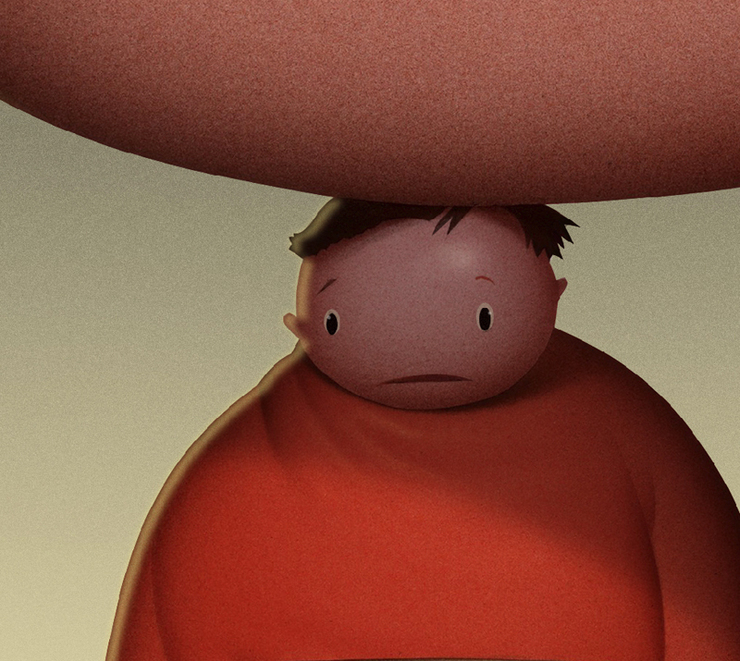
I played around with a little side lighting but seemed to be getting a bit confusing and made the figure look blurry, so i deleted it....
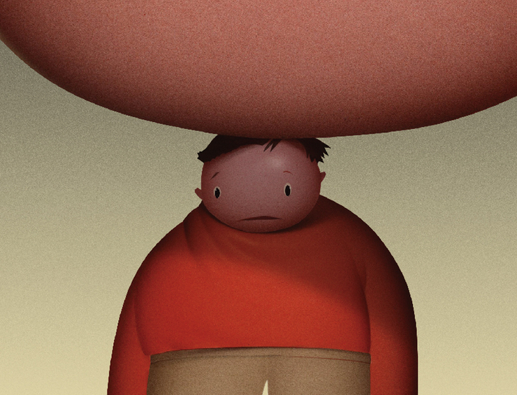
Much clearer, added a shadow to set the face back a bit and take the focus off of him...
Pretty much done now just a few little tweaks....Just need to send it off and get some feed back from Soojin...
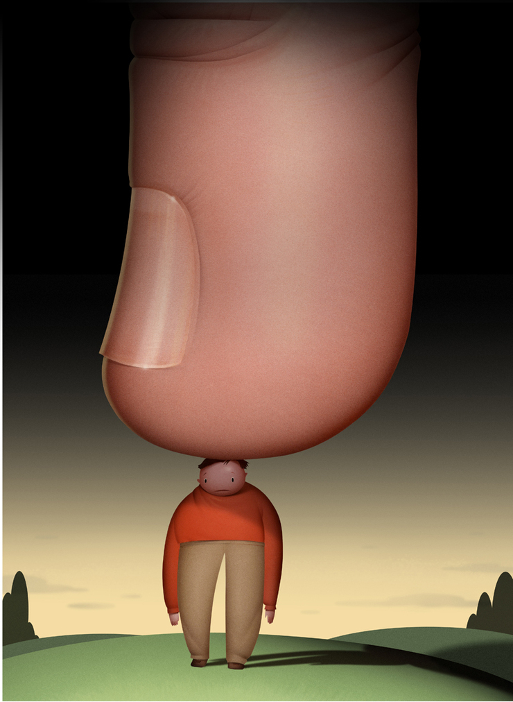
SooJin had said that the article had been put on hold for some reason . Rarely do you get a chance to look at something again after you finished. I opened up the file the other morning and played around with darkening up the backgrounds. I like the feelling this gave the illustration and thought it might work better with the type as well so I sent off to SooJin to get her take on it. Altogether I think it made for a stronger cover design.
This article was put on hold a delayed. So after it sat around for a week or so I decided to take another look at the background...
The inside spread, nice clean design. SooJin always comes through with such great design and direction . It’s always such a joy to work on these projects.
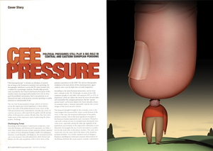
Here's a copy of the cover I snagged off the internet version of Plansponsor. I really love the way the type is interwoven with the illustration. Nice and clear...It held up pretty well even on the webversion on my iPhone. Although I would certainly prefer leafing through the magazine leasurely...

 I had already been procrastinating on a little book cover, when I got a call from Mihn at the Times. Another spot illustration to be done. This time the theme was the fear keeping people frozen and hindering our echonomic recovery. The headline in the text kind of pointed directly at the concept of having some figure caught up and frozen with fear. Seemed pretty straight forward. Mihn sent me the article wednesday night and the deadline final was set for Friday 3:00 pm est, so not much time to screw around. I read the article about as far as I needed to ge thinking about concepts and left it till Thursday am to start on thumbaniils. I got in around 8:00 and made coffee, did some emails and about 8:30 started on thumnails. At 9:30 I sent them over and called to let him know they were there. I tried some different things I thought would work. Old clichés, you know, being afraid of your shadow, mouse /elephant, caught in the headlights, etc. Then I thought about the painting that Edvard Munch did of The Scream. I thought that could make a pretty funny little parody. Lee liked it too.So cross my fingers and with any luck......

 I piddled around on a tattoo design till about eleven and then called Mihn again just to check in. He loved the Edvard Munk parody and so did Lee. I thought this would be a fun one. I wanted to paint it just like the painting, but with a bull in the forground, and a bear instead of the couple in the background....Too funny. I thought I would get my walk in first though. Everyday I drive out to Stone Mountain for my daily walk collecting recycling at our local state park. ( It's really about an hour and a half including drive and hike up the mountain ect...) Mihn called me back a little quicker than I expected with the news "they wanted they're original idea of the deer in the headlights." When I did the little thumbanil and scanned it in the original idea was to just put dollar signs in his eyes this thought with the shadow came later ...
 I finished my walk and got back to the studio about 1:00. I did the sketch and transfered it down and then started airbrushing. Lee and I were suppposed to meet our son and his family for their anniversary at "Trader Vick's" a campy Tahitian restaurant (They got married in Hawaii), so I needed to finish this one By 5:00. Not so hard right? it was a simple image and as long as I could stay on task, well except for the Michelle Bachman Youtube, and some drop in company, I almost made it, but saveded it till in the morning instead of rushing it. Friday moring I hit the studio pretty early and By 9:30 I had finished scanned and tweaked out the drawing added the shadow and question marks,and sent it for Mihn to review. Only one version this time...So the rest of the day was free to head back to the mountain. work on some personal work and go climbing with my good friends Goñi and Holly . Looking back at it I could have done something more complicated but this image worked with the article. We'll just have to save the "Munch" till another day...
 Instead of bugging out and going climbing.I could have stuck with it and tried a bunch of photo-shopped variations
 Or brighter
 Or made bunches of them...
 or turned them into candy....
But somehow the original worked without all of that....and we had a blast climbing...Looking back at these pieces I think the face does show up better without the shadow. But the shadow adds a little something conceptual in there and the face couldn't goo dark and have the shadow read.
or turned them into candy....
But somehow the original worked without all of that....and we had a blast climbing...Looking back at these pieces I think the face does show up better without the shadow. But the shadow adds a little something conceptual in there and the face couldn't goo dark and have the shadow read.