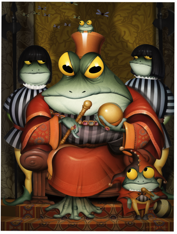
Here is the final illustration with everything put together....This illustration was so complicated I didn't see how the silhouetted figure in the foreground was going to work..... © Bill Mayer 2011
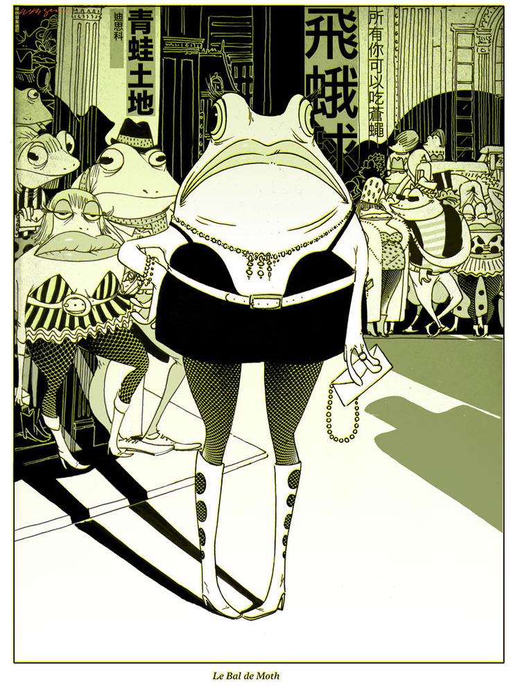
Always the highlight of my year, I can count on Jim Burke to come through with another opportunity for a new frog. This year, like last, it was just too hard to stop drawing new candidates for the calendar. Some in expected directions, some in the line style I have been experimenting with, and some revisiting things I stumbled onto last year. Truth be told, it's just an excuse to do some frog drawings just for fun.


Started out with the normal thumbnail exhaustion.... Jim picked the king. I was not really falling in love with it, so another batch of ___ more thumbnails and we had one that seemed to work. Jim suggested putting a little jester in front, so I added that in the sketch. He clarified that he meant to put one in the front, standing. I tried this in a bunch of thumbnail directions... It seemed too complicated but I understod the Idea and ended up sketching them up and rendering them to try to make it work. In the final, though, it ultimately was like I expected. Just too distracting from the great charater study of the King Frog.

I started with the sketch transferred to a board and airbrushed the Main part. Scanned the illustration in and cut paths and retouched.

I start building the backgrounds in Photoshop.First with flat colors ,later adding shadows and detail....

Ugh to many stripes so I pulled in some textures for the backgrounds and rug on the floor. I used transform warp to pull the textures to fit my original sketch which I pull into the file and register. Adjust the colors in Hue....

Started adding more detail and decided to add some little flies hovering around his head.....more shadows to give the drawing some depth...Added some quick battle axes, done in Phototshop.

Adding this little frog was completely an after thought, so I swiped some bits and pieces and made him out of several other frogs. The body from the jester at the bottom, and the hands from the King Frogs feet. Just transformed to make them fit better....Some buggy eyes and he's good to go.

The King Frog, Dellas Graphics, © Bill Mayer 2011
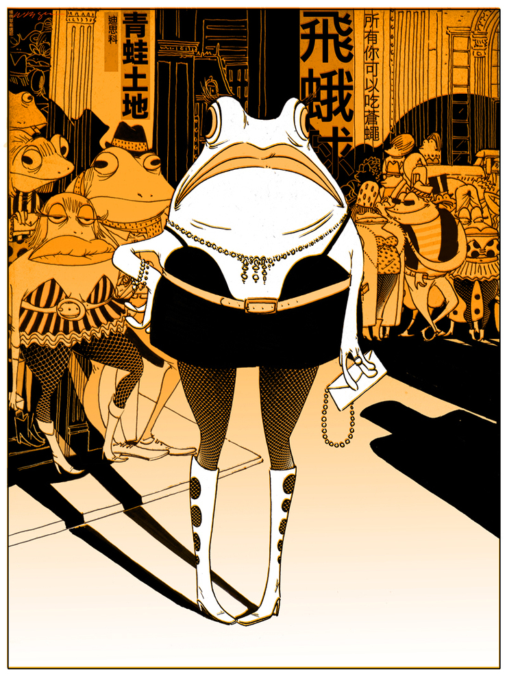
Jim Burke really liked the idea of having the jester in the foreground, so I was determined to at least give it a try. I darkened the figure in the foreground and put several layers in between, lighting the background and creating some visual distance in between the two. Added a little reflected light also to cool down the foregound figure. Boy this was starting to get really complicated..... Maybe blurring the background image would help...Still not sure which direction to go with. So much fun, not sure when it's due either, but i'm sure we'll be doing changes until we ship it out. Hey Jim When is this thing due?

I think this is Jim's final pick.

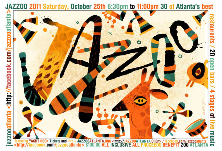
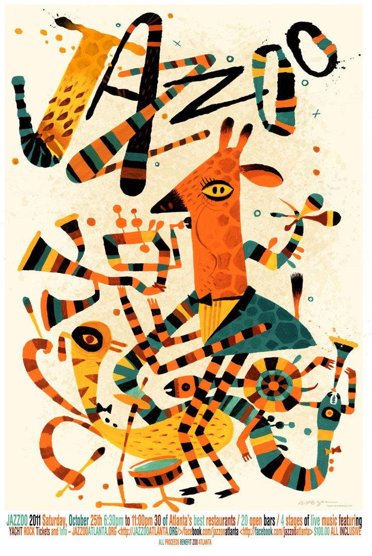 Here is the final poster with the type I decided to just put on the bottom. the poster was so busy i didn't see how to add it into the face of the 24"x36"poster. © Bill Mayer 2011
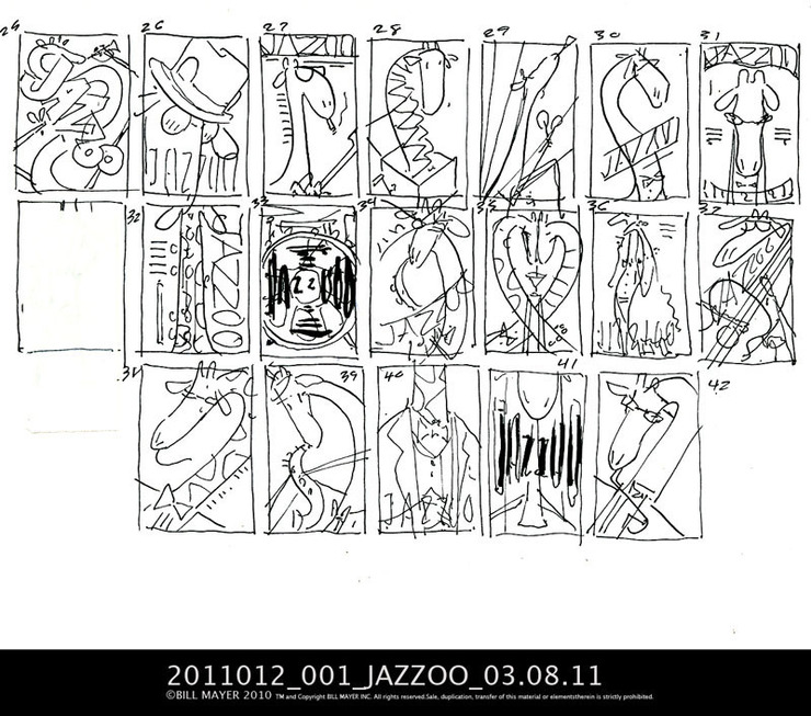
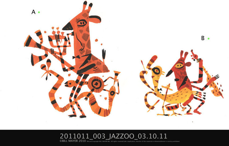
If it's not apparent, JAZZOO is a fundraising event for the Atlanta Zoo. When I got a call to do this poster, it was pretty much an open canvas. Jeff Stewart, the art director, had gone through my fickr site and pulled off some old samples of "Blind Boys" and other samples of some of the more folk-art styles I had done a few years back. He sent them to me as a possible direction. I did the normal "bunches of thumbnails" exploration. They were having a lot of trouble understanding the thumbnails so I took a few and added color to make them easier to understand. As an after thought I did a second bunch of fun little folk art versions. Lee liked the folk art ones, but said "they'll never go in that direction..." It's great when clients act unexpectedly, and occasionally, it can make for some fun outcomes.
Here is the final poster with the type I decided to just put on the bottom. the poster was so busy i didn't see how to add it into the face of the 24"x36"poster. © Bill Mayer 2011
If it's not apparent, JAZZOO is a fundraising event for the Atlanta Zoo. When I got a call to do this poster, it was pretty much an open canvas. Jeff Stewart, the art director, had gone through my fickr site and pulled off some old samples of "Blind Boys" and other samples of some of the more folk-art styles I had done a few years back. He sent them to me as a possible direction. I did the normal "bunches of thumbnails" exploration. They were having a lot of trouble understanding the thumbnails so I took a few and added color to make them easier to understand. As an after thought I did a second bunch of fun little folk art versions. Lee liked the folk art ones, but said "they'll never go in that direction..." It's great when clients act unexpectedly, and occasionally, it can make for some fun outcomes.
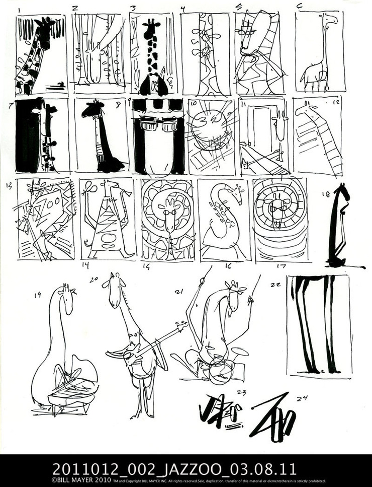
 colored a few thumbnails to make them easier to understand.
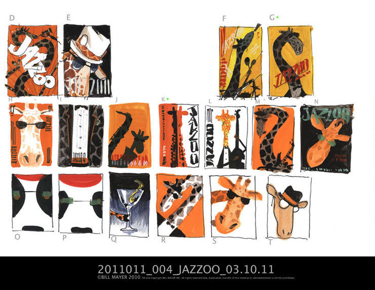 My after thought on thumbnails. We all loved this direction but were convinced that the client would not go this way..© Bill Mayer 2011
Part of the direction was that the poster had to be of a giraffe. I really didn't think about it much before I started, but that long neck became quite a problem. Tried everything I could think of to work my way around it; hooking it around, over the top, or just cutting it off. I think that is why, when it came to the little folk art versions, I decided to just " Picasso" it and ignore the long neck and move the mouth down and make it into a little face. This worked out better than I had hoped. They loved this direction and their only comment was to make the drawing more colorful. So I took the little thumbnail and comped up a version with the colors close to the way I thought it would work. then printed it out and painted over it on the light box. worked pretty well.
My after thought on thumbnails. We all loved this direction but were convinced that the client would not go this way..© Bill Mayer 2011
Part of the direction was that the poster had to be of a giraffe. I really didn't think about it much before I started, but that long neck became quite a problem. Tried everything I could think of to work my way around it; hooking it around, over the top, or just cutting it off. I think that is why, when it came to the little folk art versions, I decided to just " Picasso" it and ignore the long neck and move the mouth down and make it into a little face. This worked out better than I had hoped. They loved this direction and their only comment was to make the drawing more colorful. So I took the little thumbnail and comped up a version with the colors close to the way I thought it would work. then printed it out and painted over it on the light box. worked pretty well.
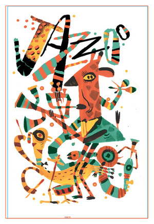 This is the little comp I did, pulling all of the elements from the thumbnails together and organizing them to get a clearer idea of how the drawing would work. Some of the final editing came through after the painting was done to make it read better .We opened up the distance inbetween the characters and the type. I had initially thought about hand doing the other type until they sent me final copy. too much to squeeze into the illustration , Which seemed crowded already so I put the Type at the bottom.This will make it easy to edit as I am sure the copy will change several times before we go to print.
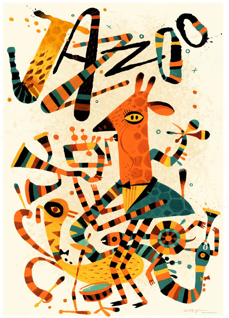 When I posted this on Facebook last week a couple of people mentioned a nod to the modernist. I really wasn't trying for that but when it was all finalized and put together it did remind me of one of those great cubist circus posters they used to do back in the 1960's. I can definately see some Flora infulence. Some of their wacked out cubist drawings are just so inspiring. My grandson Forest said, "Oh, retro Bill Mayer!..." I guess he's remembering those old scatchboard drawings I did of the birds ......the skeleton and The Blind Boys of Alabama....
 HERE IS THE POSTCARD VERSION © Bill Mayer 2011